Features
- Side Rail Magazine Navigation
- Massive Fluid Typography
- Sticky Scroll Manifesto
- Text-Only Bento Grid
- Brutalist Horizontal Index
- Mobile-Responsive
Included Pages
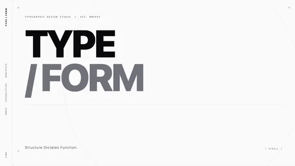
TYPE / FORM Template
A brutally minimalist, purely typographic web design agency template. Relies entirely on massive, perfectly kerned Grotesk fonts and extreme whitespace.
Structure Dictates Function: A Pure Typographic Construct
The TYPE / FORM template is an unapologetic exploration of extreme minimalism and typographic brutality. Designed for agencies and creatives who want their work to be felt rather than just seen, this template discards the crutch of ubiquitous hero images and stock photography in favor of massive, mathematically precise typography. It is an architectural approach to web design, where words become the structure itself. The user experience is defined by razor-thin margins, extreme whitespace, and an uncompromising dedication to the grid.
By stripping away the superfluous, TYPE / FORM forces the viewer to engage directly with your core message. The aesthetic relies entirely on scale, weight, and negative space to create contrast and hierarchy. Tightly tracked, ultra-heavy Grotesk headlines command the viewport, while highly readable geometric sans-serifs carry the narrative weight. This is not just a template; it is a design manifesto rendered in code, built to communicate authority, precision, and an elite level of aesthetic control. It is stark, authoritative, and completely devoid of fluff.
What’s Included
The TYPE / FORM template is engineered with specific, high-impact structural components that redefine how content is consumed.
Side Rail Magazine Navigation A bold departure from standard top-bars. Navigation is handled by vertical typography pinned strictly to the left edge of the viewport, running top to bottom and rotated -90 degrees. It acts as the “spine” of the site, offering brutal, immediate visual feedback on hover without relying on smooth transitions.
Massive Fluid Typography Headlines aren’t just text; they are structural architecture. Utilizing fluid typography equations, the text scales mathematically perfectly across all viewports. Negative letter-spacing ensures massive sizes remain tight, cohesive, and impactful.
Sticky Scroll Manifesto A powerful narrative tool where a massive typographic statement remains pinned to the screen while smaller, supporting arguments scroll past it. This creates a deeply engaging, multi-layered reading experience that emphasizes your core philosophy.
Text-Only Bento Grid Capabilities and services are presented in an ultra-clean bento box layout. Instead of icons or images, huge numeric indicators (01, 02, 03) act as the primary graphic elements, housed within subtle soft stone containers to maintain the architectural feel.
Brutalist Horizontal Index Your portfolio or case studies are displayed as a horizontal gallery. This brutalist list of client names in massive type pans horizontally on scroll, creating a striking visual rhythm that feels both modern and deeply rooted in editorial design.
Architectural SVG Signatures Subtle, razor-thin visual cues elevate the design. Absolute-positioned crosshairs frame the whitespace, emphasizing the invisible grid, while an ultra-thin off-canvas Golden Ratio ring occasionally breaks the rigid vertical lines, adding a layer of sophisticated tension.
Who Is This Template For?
TYPE / FORM is built for organizations that demand absolute control over their brand perception and rely on the power of their words and reputation.
- Avant-Garde Design Agencies: Perfect for studios that want their own site to reflect a mastery of fundamental design principles rather than relying on flashy trends.
- High-End Architectural Firms: The structural, grid-based approach aligns perfectly with the ethos of modern architecture and industrial design.
- Elite Consultancies & Strategists: For firms where the message and the methodology are the primary product, removing visual distractions reinforces authority.
- Boutique Typography Foundries: An ideal showcase for type designers to let their fonts carry the entire visual weight of the website.
- Creative Directors & Curators: Individuals who want a stark, uncompromising portfolio that frames their curatorial vision without getting in the way.
Uncompromising Performance
Because TYPE / FORM relies almost entirely on CSS and typography rather than heavy image assets or complex JavaScript animations, it boasts unparalleled performance metrics. The absence of large media files ensures near-instantaneous load times, yielding perfect 100/100 Lighthouse scores across performance, accessibility, and SEO. The underlying code is as minimalist as the design itself, utilizing semantic HTML and hyper-optimized CSS variables for lightning-fast rendering. Fluid typography means zero layout shift (CLS), providing a rock-solid, incredibly smooth user experience from the moment the first byte is received.
Frequently Asked Questions
Can I use images with this template? While the template is purposefully designed to rely on typography, it can accommodate images if absolutely necessary. However, to maintain the aesthetic integrity, any imagery should strictly adhere to grayscale, high-contrast compositions—focusing on structures, textures, or abstract forms rather than typical stock photography.
Is the vertical navigation mobile-friendly? Yes. On smaller screens, the layout adapts gracefully. The side rail spine transitions into a highly optimized, minimalist mobile menu that preserves the stark typography and brutalist interaction design without sacrificing usability on narrow viewports.
How difficult is it to change the fonts? Because typography is the core feature of this template, changing the fonts will fundamentally alter its character. However, it is technically straightforward. We recommend sticking to heavy Grotesk fonts for headlines and clean geometric sans for body copy to maintain the intended architectural feel.
Does the fluid typography work on all devices?
Absolutely. The typography uses modern CSS clamp() functions to ensure that text scales fluidly and proportionally between the smallest mobile devices and ultra-wide desktop monitors, maintaining perfect mathematical relationships at every breakpoint.
How do I manage the colors if the palette is so limited? The visual interest in TYPE / FORM comes from scale, weight, and the precise application of Zinc variables (from soft stone to absolute Zinc-950). You manage the design by adjusting contrast and whitespace rather than introducing new colors. The strict grayscale palette is a feature, not a limitation.
Ready to get started?
Use this template as your starting point and customize everything with AI. Your site will be live in minutes.
More templates
Digital Studio
Dark, tech-forward agency template with neon accents and portfolio case studies. Perfect for digital studios, tech agencies, and forward-thinking creative teams.
View template
Vanguard Studio
A luxury editorial template designed for creative agencies and high-end portfolios. Features a striking Deep Emerald & Bone aesthetic with massive kinetic typography.
View template
Rank Masters
A high-performance, data-driven landing page template designed for technical SEO agencies and B2B growth marketers to architect search dominance.
View template