Features
- Asymmetric Hero Reval
- Dynamic Bento Grids
- Sticky Scroll Mechanics
- Horizontal Marquee Gallery
- Glass Dock Navigation
- Mobile-Responsive
Included Pages
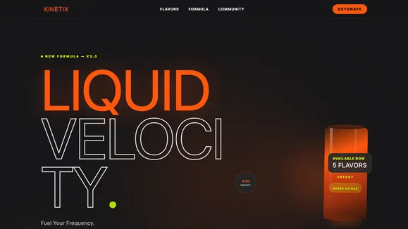
KINETIX Template
A high-octane, neon-drenched showcase template designed to detonate your brand presence with aggressive typography and hyper-fast interactions.
Fuel Your Frequency: The KINETIX Experience
KINETIX is not just a website template; it is a digital adrenaline shot designed to ignite your user’s neuro-pathways. Engineered for brands that refuse to blend in and demand to be seen, this high-octane showcase layout detonates on the screen with massive, architectural typography and an unapologetic, hyper-vibrant aesthetic. Operating in a deep void black (#09090b) environment, KINETIX weaponizes electric neon orange (#ff4d00) and radioactive lime (#ccff00) to force your product, message, and brand identity into the absolute spotlight.
Every interaction is relentless. Every scroll delivers a surge of forward momentum. We discarded the safe, corporate playbook to build a raw, playful, Gen-Z optimized experience that crushes the competition and dominates the visual landscape. From the chaotic, asymmetrical hero section that throws users immediately into the action to the hyper-fast social proof galleries that demand attention, this template is strictly built for velocity. Dominate your market. Surge past the noise. KINETIX gives you the absolute power to transform passive visitors into hardcore brand loyalists the second they land on your page. Don’t just wake up. Detonate.
What’s Included
The KINETIX template is fully loaded with high-performance, conversion-focused sections engineered to keep users scrolling, clicking, and engaging with your brand.
Asymmetric Hero with Big Type Reveal First impressions matter, and KINETIX hits hard. The massive, staggered text takes up the left side of the screen, creating a striking, brutalist anchor. A giant, ultra-high-resolution product cutout floats off-center on the right, overlapping the typography. This slightly off-balance composition implies relentless forward momentum, raw energy, and immediate action.
Dynamic Bento Grid Layouts
Showcase your products, flavors, or core features through a highly engaging, masonry-style Bento grid. Utilizing deeply rounded corners (rounded-3xl) and elevated zinc-900 surfaces, these cards provide a premium yet organic feel. Enhanced with subtle CSS-only speed lines and floating neon plasma orbs in the background, the grid makes your flat imagery feel like it possesses kinetic vibration.
Sticky Scroll Mechanics Engage your audience with highly interactive storytelling without sacrificing scroll speed. The formulation and ingredients section utilizes a sticky scroll interaction where your hero product locks to the center of the viewport. As the user scrolls, massive, fluid typography detailing active ingredients and benefits scrolls past on the right, keeping the focus entirely on your product while delivering crucial marketing copy.
Continuous Horizontal Marquee Gallery Social proof needs to feel alive. KINETIX includes a hyper-fast, continuously scrolling horizontal marquee designed to house vibrant lifestyle photography, motion-blurred action shots, and aggressive pull-quotes. This creates a relentless wall of community validation that reinforces the chaotic, high-energy vibe of your brand.
Glass Dock Bento Bar Navigation Say goodbye to boring top-header menus. KINETIX features an innovative, iOS-inspired “Bento Bar” navigation floating at the bottom center of the viewport. Built with pure CSS, these pill-shaped, backdrop-blurred tiles scale up and fill with blinding neon orange on hover. It is a massive design statement that provides instantaneous, tactile feedback without relying on heavy JavaScript execution.
Mobile-Responsive Fluid Typography
Your message must hit just as hard on a massive ultra-wide monitor as it does on a compact smartphone screen. KINETIX utilizes advanced CSS fluid clamp utilities (clamp(3rem, 8vw, 12rem)) to ensure that your brutalist sans-serif headlines perfectly scale to any device, maintaining their loud, architectural presence everywhere.
Who Is This Template For?
KINETIX is precision-engineered for the rule-breakers, the disruptors, and the brands that operate at maximum velocity.
- Energy Drink & Supplement Brands: Showcase your explosive flavors, intense formulations, and high-octane brand lifestyle with a template that perfectly matches the energy inside your cans.
- Extreme Sports & Streetwear Apparel: Highlight motion-blurred athletes, high-contrast night shoots, and gritty, hyper-saturated lookbooks in an environment built for raw attitude.
- E-Sports Teams & Gaming Hardware: Connect with a Gen-Z and millennial audience using cyberpunk-inspired neon accents, deep void backgrounds, and high-tech Bento UI elements.
- Disruptive D2C Products: Break out of the endless sea of minimalist, pastel-colored e-commerce sites. Use KINETIX to make an unforgettable, aggressive statement that stops the scroll.
- Music Festivals & Nightlife Events: Capture the chaotic, vibrant, and electrifying atmosphere of your events with floating plasma orbs, massive typography, and relentless motion.
The Technical Edge: Built for Velocity
While KINETIX looks chaotic and unhinged, its underlying codebase is a masterpiece of modern, optimized engineering. We achieved this intense, kinetic aesthetic without bogging down the browser. The signature interactions—such as the expanding glass dock navigation, the pulsating neon plasma orbs, and the bento card hover states—are built entirely using hardware-accelerated CSS transitions (transition-all duration-300 ease-out). Zero bloated JavaScript libraries are required for the core visual experience, ensuring your site loads instantly and scrolls flawlessly at 60 frames per second.
Furthermore, aggressive design does not mean compromising on accessibility. KINETIX rigorously adheres to WCAG AA standards. The crisp zinc-100 off-white text against the deep void black background provides an extreme contrast ratio well above the required 7:1 minimum. Even secondary accents and small print utilize strictly calibrated zinc-400 colors to guarantee a minimum 4.5:1 ratio, ensuring your high-voltage message remains perfectly legible to all users, on all devices, at all times.
Frequently Asked Questions
Can I change the neon orange and radioactive lime to match my brand colors?
Absolutely. KINETIX is built on a highly organized CSS variable system. By simply updating the PRIMARY and ACCENT hex codes in the global stylesheet, the entire site—including the glowing plasma orbs, buttons, and hover states—will instantly adapt to your specific brand identity.
Is the bottom-floating Glass Dock navigation user-friendly on mobile? Yes. The bottom placement actually improves mobile usability by keeping critical navigation links directly within the user’s “thumb zone.” On smaller screens, the bento bar smartly collapses or stacks to ensure it never obstructs your vital content while remaining instantly accessible.
How difficult is it to update the images in the Bento Grid?
Updating the Bento grid is completely straightforward. The template uses standardized aspect ratios (aspect-square for bento cards, aspect-[3/4] for tall lifestyle shots). As long as you drop in your high-vibrant, contrast-heavy images, the CSS framework automatically handles the rounded corners, overlays, and responsive sizing.
Will the massive typography break on smaller screens?
No, the typography is fundamentally unbreakable. Instead of using rigid pixel sizes, KINETIX utilizes modern CSS clamp() functions. This means the text fluidly and mathematically scales down based on the exact viewport width, guaranteeing that your headlines always look architectural and deliberate, whether on a 4K display or an iPhone.
Do I need to know JavaScript to manage the animations? Not at all. The core philosophy of KINETIX is pure speed. The hover effects, scaling nav tiles, and glowing background elements are purely CSS-driven. You achieve a highly interactive, premium “animated” feel without writing or maintaining a single line of complex JavaScript logic.
Ready to get started?
Use this template as your starting point and customize everything with AI. Your site will be live in minutes.
More templates
Construction & Renovation
Professional template for construction companies, renovation contractors, and home improvement businesses. Features project gallery, services, and quote request forms.
View template
Design Furniture Luxury
Elegant template for high-end furniture stores and luxury interior design showcases. Minimal, gallery-driven layout that lets your products speak for themselves.
View template
Cut Throat Cartel
A neo-brutalist, high-contrast Astro template built for barbershops, tattoo parlors, and raw streetwear brands that want to make an unapologetic statement.
View template