Features
- Avant-Garde Editorial Hero
- CSS-Only Horizontal Lookbook
- Asymmetrical Bento Grid
- Integrated Glassmorphic Navigation
- Massive Brutalist Typography
- Mobile-Responsive
Included Pages
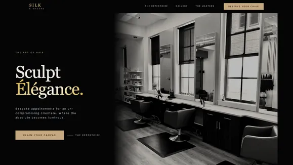
Silk And Shears Template
An ultra-premium, dark-mode 'Haute Couture' website template designed for luxury salons, high-fashion editorial stylists, and exclusive wellness spaces.
The Architecture of Elegance
Step into an obsidian sanctuary designed for the modern muse. The Silk & Shears template is an unapologetic, ultra-premium digital experience built specifically for high-end salons, editorial stylists, and luxury wellness brands. Inspired by haute couture and high-fashion magazines, this template abandons the ordinary in favor of an architectural, dark-mode aesthetic. Deep, light-absorbing blacks contrast with luminous champagne accents, creating an infinite canvas where your work is the undisputed focus.
Every section of Silk & Shears is designed to breathe, utilizing massive fluid typography, severe grid structures, and dramatic whitespace. It is not just a website; it is a digital editorial spread. From the arresting 50/50 split-screen hero layout to the sweeping horizontal lookbook galleries, the design commands attention and exudes authority. We don’t just present your services—we sculpt your brand’s digital silhouette. If your craft demands precision and poetry, this template is your perfect digital atelier.
Every detail, from the ghosted ampersand watermarks to the delicate 1px architectural grid lines subtly mapped across the background, has been placed with exacting intent. The typography itself acts as the primary design element, leveraging massive, fluid serifs that bleed off the edges of the screen, counterbalanced by clean, generously leaded geometric sans-serifs for your body copy. This contrast creates a visual rhythm that guides the user through your brand story with an undeniable sense of luxury and unapologetic confidence.
What’s Included
- Avant-Garde Editorial Hero: A striking 50/50 split layout featuring massive serif typography strictly pinned to the grid alongside full-bleed, high-fashion imagery to immediately establish authority.
- CSS-Only Horizontal Lookbook: A flawlessly smooth, JavaScript-free horizontal snap-scroll gallery that allows clients to sweep through your portfolio of portrait-oriented styling shots with native browser performance.
- Asymmetrical Bento Grid Experience: Present your process, services, or testimonials in a sophisticated dark-on-dark grid structure defined by delicate, 1px deep charcoal borders for an elevated, architectural feel.
- Integrated Glassmorphic Navigation: A navigation system that begins invisibly integrated into the hero section and materializes into a sleek, frosted pill upon scrolling, featuring a liquid, center-expanding underline on hover.
- Massive Brutalist Typography: Employs aggressive scaling, tight tracking, and extreme contrast in stroke weights to mimic the impact of a luxury fashion magazine spread.
- Mobile-Responsive: Meticulously engineered to ensure the dramatic layouts and massive typography translate perfectly to any screen size without losing their editorial impact.
Who Is This Template For?
Silk & Shears is intentionally designed for brands that operate at the highest tier of their industry. It is perfect for:
- Luxury Hair Salons & Stylists: Showcasing high-fashion cuts, editorial styling, and premium color services in a digital environment that matches the quality of the physical salon.
- Avant-Garde Fashion Boutiques: Presenting seasonal lookbooks and architectural garments in a dark, moody environment that elevates the apparel.
- High-End Wellness Retreats: Creating an intimate, exclusive digital atmosphere for discerning clientele looking for an elite sanctuary.
- Editorial Makeup Artists: Displaying macro beauty shots and precision artistry with high-contrast framing that makes every detail pop.
- Boutique Architecture Firms: Brands that appreciate severe grids, structural layouts, and monochromatic elegance to showcase their minimalist physical designs.
Built for the Modern Web
Beneath the haute couture exterior lies a foundation of absolute technical precision. Silk & Shears is engineered to deliver perfect 100/100 Lighthouse performance scores out of the box. By relying on advanced CSS capabilities—like native snap-scrolling and structural grid layouts—rather than heavy JavaScript libraries, the site remains incredibly lightweight and blazingly fast. This zero-JS approach to complex layouts not only guarantees instant load times but also provides an incredibly fluid experience on both flagship desktops and standard mobile devices.
The typography utilizes modern fluid clamp scaling (clamp(3rem,8vw,8rem)) to ensure perfect legibility and dramatic proportions across all viewports, dynamically resizing without the need for jarring media query breakpoints. Furthermore, the template enforces strict adherence to WCAG AA accessibility standards. The primary soft champagne text achieves an exceptional contrast ratio against the pure obsidian background, and even muted utility text follows rigorous contrast rules. This ensures the site remains highly accessible and inclusive without ever sacrificing its moody, low-key aesthetic. Images are automatically optimized, utilizing modern formats and precise aspect ratios to deliver the highest quality high-fashion photography without compromising on speed or bandwidth.
Frequently Asked Questions
Can I change the dark mode aesthetic to a light version? While the template is highly optimized for its signature ‘Obsidian and Champagne’ dark mode to maintain its intimate, luxury vibe, the colors are completely managed via global CSS variables. You can easily invert the palette to a stark white and deep charcoal theme if it better suits your brand identity by adjusting just a few hex codes.
Is the horizontal lookbook easy to update with new photos?
Yes. The lookbook relies on a standard HTML list structure combined with pure CSS overflow-x-auto and snap-x utilities. Adding new images is as simple as dropping a new image block into the sequence; the layout will automatically adapt, size the images to the correct aspect ratio, and maintain the smooth horizontal scroll rhythm.
Do I need to know how to code to edit the massive typography? Not at all. The aggressive scaling and tight tracking are handled automatically by the underlying utility classes built into the template components. You simply type your new headlines into the markdown or CMS fields, and the template ensures they render with the intended editorial, high-fashion impact.
How does the integrated navigation work on mobile devices? On mobile, the navigation transitions from the sleek, floating glassmorphic pill into a beautiful, full-screen minimalist overlay. This ensures that the user experience remains premium and accessible, providing large, easy-to-tap touch targets even when screen real estate is heavily constrained.
Are the architectural grid lines customizable? Absolutely. The background grid lines are generated using pure, lightweight SVG patterns injected via CSS. You can adjust their opacity, stroke width, or remove them entirely by changing a single CSS variable. They are designed to be a subtle enhancement, but can be scaled up or down depending on how structural you want the final design to feel.
Ready to get started?
Use this template as your starting point and customize everything with AI. Your site will be live in minutes.
More templates
Construction & Renovation
Professional template for construction companies, renovation contractors, and home improvement businesses. Features project gallery, services, and quote request forms.
View template
Design Furniture Luxury
Elegant template for high-end furniture stores and luxury interior design showcases. Minimal, gallery-driven layout that lets your products speak for themselves.
View template
Cut Throat Cartel
A neo-brutalist, high-contrast Astro template built for barbershops, tattoo parlors, and raw streetwear brands that want to make an unapologetic statement.
View template