Features
- Swiss Typography Grid
- Bento Grid Curriculum
- Vertical Split-Scroll
- Asymmetric Multi-Grid
- High-Contrast Aesthetics
- Mobile-Responsive
Included Pages
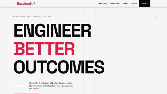
Skill Craft Workshop Template
A professional educational workshop series template featuring a strict Swiss typographic grid and structured bento blocks.
Master the Architecture of Design
Stop guessing and start structuring. The Skill Craft Workshop template—internally known as Baselcraft—is a brutal, uncompromising, and highly structured landing page designed specifically for professional educational workshop series. It embraces the timeless, authoritative principles of the International Typographic Style (Swiss Design) to deliver a precise and unyielding user experience. Every single element on the page earns its place on the grid, commanding attention through massive fluid typography, stark backgrounds, and singular, unapologetic accent colors.
Designed for master craftsmen teaching the fundamentals of design, engineering, or intensive bootcamps, this template projects absolute precision and unshakeable confidence. With its architectural padding, strict typographic hierarchies, and sharp bento box layouts, it immediately establishes your workshop as a premium, intensive, and results-driven event. The high-contrast aesthetic—anchored by a stark Zinc background, an almost-black text layer, and an arresting “Swiss Red” accent—guides the user’s eye effortlessly toward your conversion points.
We have stripped away the fluff, the soft rounded corners, and the ambiguous copy. What remains is a digital environment that speaks with authority. Whether you are selling a weekend design intensive, a software architecture bootcamp, or an executive masterclass, Baselcraft positions you as the definitive expert. Build systems that scale, endure, and convert with a template that embodies the very discipline you teach.
What’s Included
- Swiss Typography Grid: Massive fluid sans-serif headlines, tightly tracked grotesk typography, and highly readable geometric sans body copy. The severe negative letter-spacing creates solid blocks of text that demand attention and project authority, while the generous line height in the body ensures absolute readability.
- Bento Grid Curriculum: A strict, 3-column bento box layout to meticulously outline your workshop modules. Featuring sharp, unrounded corners, solid separating lines, and brutal color-fill hover states that snap instantly to your primary accent color for immediate, tactile feedback.
- Vertical Split-Scroll Manifesto: An engaging, asymmetric layout where a massive sticky headline anchors the left side of the screen while punchy, definitive paragraphs of your core philosophy scroll seamlessly on the right, keeping the user anchored while digesting your message.
- Asymmetric Multi-Grid Alumni Roster: A staggered, brutalist typographic list designed to showcase real outcomes, past attendee successes, and testimonials. It deliberately abandons the cliché card carousel in favor of a layout with true structural integrity and visual weight.
- Asymmetric Signature Navigation: A heavy, bleeding logo placement paired with small, widely-tracked monospaced navigation links pushed to the extreme top right. The navigation features instant color-fill hover states—no smooth fades, just raw, immediate user feedback.
- Minimalist Hero Architecture: An edge-to-edge typographic statement hero section. Stripped of unnecessary illustrations, it relies on sheer scale, visible grid lines, and a single high-contrast CTA button perfectly aligned to the column structure.
- Signature SVG Decorations: Subtle, grid-breaking absolute elements—like an ultra-thin rotating crosshair registration mark and a 1px dot-grid blueprint mesh—that add depth and technical sophistication without compromising the strict architectural layout.
Who Is This Template For?
The Skill Craft Workshop template is engineered specifically for uncompromising educators, technical agencies, and industry leaders who want their landing page to rigorously reflect the quality and discipline of their curriculum.
- Design & Engineering Bootcamps: Perfect for intensive coding bootcamps, structural UX/UI workshops, and technical architecture seminars that demand a highly structured, deeply professional aesthetic to match their rigorous syllabus.
- Masterclass Instructors: Ideal for industry veterans, seasoned consultants, and master craftsmen offering premium, high-ticket educational series that require an undeniable, authoritative brand presence.
- Architecture & Industrial Design Studios: Suits physical design firms hosting symposiums, portfolio reviews, or spatial design workshops, seamlessly translating their physical design language into a digital format.
- B2B Training & Consultancy Seminars: Excellent for corporate trainers delivering unyielding, results-oriented training programs where marketing fluff is not tolerated and concrete outcomes are paramount.
- Creative & Branding Agencies: Forward-thinking agencies launching specialized workshops, community events, or internal training modules that want to stand out with a confident, brutalist, Swiss-inspired digital experience.
Performance & Technical Excellence
Beyond its striking visual architecture, the Skill Craft Workshop template is built on a foundation of absolute technical precision. Following strict WCAG AA accessibility constraints, the high-contrast palette ensures optimal readability across all devices. The Zinc 950 text on Zinc 100 backgrounds maintains a contrast ratio exceeding AAA standards, while interactive bento blocks ensure text flips dynamically to pure white to maintain AA compliance when hovering.
The template is highly optimized for maximum Core Web Vitals performance. The brutalist, image-light design—relying heavily on CSS grids, system or highly optimized web fonts, and lightweight SVG primitives—guarantees lightning-fast load times. CSS-only interactions, such as the instant snap color fills on hover, completely eliminate JavaScript interaction bloat. This ensures your landing page feels snappy, instantly responsive, and incredibly resilient. The underlying fluid typography system automatically scales massive headlines flawlessly from massive desktop monitors down to mobile viewports without ever breaking the sacred grid.
Frequently Asked Questions
Is the massive fluid typography fully responsive on smaller mobile devices?
Absolutely. The massive headlines utilize advanced CSS clamp functions (for example, text-[clamp(3rem,8vw,10rem)]), ensuring that the typography scales down proportionally. It maintains its tight tracking and block-like structure on mobile screens without causing horizontal scrolling, layout shifts, or legibility issues.
Can I change the “Swiss Red” accent color to match my own brand palette? Yes. While the template is designed around an arresting Rose 600 accent to perfectly fit the brutal Swiss archetype, all color variables are globally centralized in the CSS file. You can easily swap out the primary color to fit your brand guidelines while maintaining the stark Zinc background and high-contrast text.
Does this template include a blog setup for ongoing content marketing? Yes. Recognizing that educational platforms and thought leaders often need to share long-form content to drive SEO, the template includes a fully structured, typography-first blog layout. It adheres to the exact same strict grid principles, utilizing generous line heights and maximum-width containers for optimal long-form reading.
How do the instant hover states work without relying on JavaScript?
The brutal, instant feedback interactions—where bento backgrounds snap to the primary color and text snaps to white—are built entirely using native CSS pseudo-classes (:hover). By intentionally removing the transition properties, we achieve that raw, instantaneous feedback signature required by the design brief, keeping the site incredibly lightweight and performant.
Are the strict bento layout grids difficult to modify if I need more or fewer columns? Not at all. The underlying structural architecture relies on standard, predictable Tailwind CSS Grid and Flexbox utilities. The 3-column Bento Curriculum section, for example, can be easily adjusted to 2 or 4 columns by changing a single grid-template-columns utility class, allowing the architectural foundation to seamlessly adapt to the exact volume of your curriculum content.
Ready to get started?
Use this template as your starting point and customize everything with AI. Your site will be live in minutes.
More templates
Construction & Renovation
Professional template for construction companies, renovation contractors, and home improvement businesses. Features project gallery, services, and quote request forms.
View template
Design Furniture Luxury
Elegant template for high-end furniture stores and luxury interior design showcases. Minimal, gallery-driven layout that lets your products speak for themselves.
View template
Cut Throat Cartel
A neo-brutalist, high-contrast Astro template built for barbershops, tattoo parlors, and raw streetwear brands that want to make an unapologetic statement.
View template