Features
- Magazine-Style Side Navigation
- Horizontal Expedition Scroll
- Asymmetrical Bento Grid
- Fluid Topographic Typography
- Cinematic Dark Mode Aesthetic
- Mobile-Responsive
Included Pages
Summit Treks Template
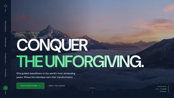
A rugged, authoritative template designed for expedition companies, adventure tourism, and outdoor brands demanding a premium, magazine-style aesthetic.
Forge Your Digital Expedition
Welcome to Summit Treks, a digital experience forged for those who conquer the unforgiving and return transformed. This isn’t a template for casual tours; it is an authoritative, awe-inspiring platform built for meticulous professionals and hardcore expeditions. Designed with a commanding “Modern” archetype, the visual language utilizes deep atmospheric slate darkness (#0F172A) contrasted with stark white text and electric marker green (#4ADE80) call-to-actions. The typography acts as the architectural foundation of the site—monolithic, fluid grotesque sans-serif headlines feel like massive slabs of rock, tightly tracked and scaling beautifully across all devices. Every section of this template breathes with monumental spacing, utilizing expansive padding to create a relentless, rhythmic flow. From the immersive, edge-to-edge landscape photography in the editorial hero to the precise, topographical SVG overlays, Summit Treks delivers a rugged yet highly sophisticated digital environment that commands respect and drives high-ticket adventure conversions.
What’s Included
The Summit Treks template includes a suite of specialized, high-impact components designed to elevate your brand’s digital presence:
- Magazine-Style Side Navigation: Breaking away from traditional top bars, this template features a bold, left-pinned vertical navigation rail. Acting like the spine of a high-end editorial magazine, it includes a signature “liquid underline” CSS-only interaction that snaps sharply on hover.
- Immersive Editorial Hero: A massive, edge-to-edge landscape hero section where typography interacts directly with the imagery. It utilizes a split-layer approach, anchoring the primary headline alongside technical metadata blocks (coordinates, elevation, difficulty) for an immediate sense of scale and precision.
- Horizontal Expedition Scroll: A performant, CSS-only horizontal scroll container that maps out your core treks. The expedition cards are styled as imposing, tall monoliths (3:4 aspect ratio) that peek into the frame, instinctively inviting users to swipe or scroll through the journey.
- The Guide Ethos Bento Grid: An asymmetrical bento grid designed to detail safety protocols, expert guides, and equipment standards. It utilizes clean, rounded corners and subtle surface offsets to organize dense technical information into digestible, highly visual blocks.
- Signature Topographic Accents: Subtle, absolute-positioned SVG contour lines and coordinate crosshairs break the rigid grid, giving the entire site a “measured” or “surveyed” precision feel without impacting load times.
Who Is This Template For?
Summit Treks is purposefully built for businesses that operate in extreme environments and require a brand presence that reflects their expertise and authority. It is the perfect starting point for:
- Mountaineering and Alpine Expeditions: Companies leading technical climbs, summit attempts, and high-altitude treks.
- High-End Adventure Tourism: Operators offering premium, challenging, and remote travel experiences.
- Outdoor Gear and Apparel Brands: E-commerce sites needing a rugged, atmospheric editorial showcase for specialized equipment.
- Wilderness Survival and Guide Services: Experts offering specialized training, backcountry navigation, and survival courses.
- Extreme Sports Documentarians: Photographers and filmmakers needing a cinematic portfolio to showcase harsh, beautiful landscapes.
Technical Power & Unforgiving Performance
Beneath the rugged aesthetic lies a meticulously engineered codebase designed for peak performance. Summit Treks relies heavily on native browser capabilities rather than bloated JavaScript libraries. The striking horizontal expedition gallery is powered entirely by CSS scroll-snapping, ensuring buttery-smooth 60fps performance even on budget mobile devices. The massive, monolithic headlines utilize advanced CSS clamp() functions (text-[clamp(3rem,8vw,8rem)]), guaranteeing that typography scales fluidly and perfectly across every viewport size without requiring complex media queries. Furthermore, the deep forest green and slate color palette has been strictly audited to ensure full WCAG AA contrast compliance in dark mode, making your content crisp and highly legible in any lighting condition. The signature topographic backgrounds are rendered using lightweight, inline SVGs, adding profound visual depth without the performance penalty of high-resolution background images.
Frequently Asked Questions
Is the side-rail navigation fully mobile responsive?
Yes. While the side-rail navigation provides a striking “magazine spine” aesthetic on desktop screens, it automatically collapses into a highly optimized, accessible mobile menu on smaller viewports to maximize the screen real estate for your breathtaking photography.
Can I easily change the deep forest green and slate color scheme?
Absolutely. The entire theme is mapped to a few core CSS variables in the global.css file. By updating the Background, Text, Primary, and Accent hex codes, you can instantly transform the site’s atmosphere from deep alpine forest to arid desert canyon or arctic ice.
How do I update the horizontal scrolling expedition cards?
The expedition cards are managed within a simple Astro component structure. You can easily add, remove, or modify the content of each monolith card, including the background imagery, trek titles, and technical metadata, without breaking the horizontal CSS scroll mechanics.
Are the topographic map backgrounds customizable?
Yes, the topographic lines and coordinate crosshairs are built using inline SVGs. You can easily adjust their opacity, stroke color, or even swap out the SVG paths to feature the actual topographical map of your specific expedition locations for an incredible localized detail.
Does this template include a blog?
Yes, Summit Treks includes a fully styled, CMS-ready blog infrastructure. The blog index and article pages share the same commanding typography, atmospheric dark mode aesthetic, and wide-breathing layouts, perfect for publishing detailed expedition reports, gear reviews, and philosophical deep dives into the wilderness.
Ready to get started?
Use this template as your starting point and customize everything with AI. Your site will be live in minutes.
More templates
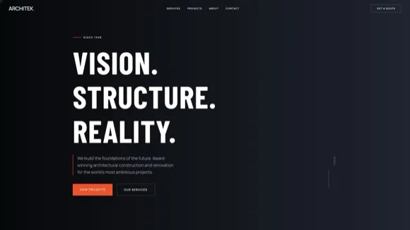
Construction & Renovation
Professional template for construction companies, renovation contractors, and home improvement businesses. Features project gallery, services, and quote request forms.
View template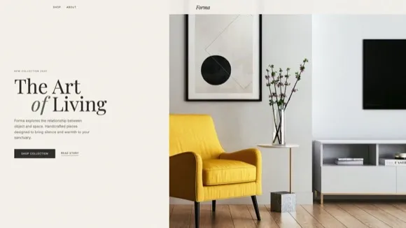
Design Furniture Luxury
Elegant template for high-end furniture stores and luxury interior design showcases. Minimal, gallery-driven layout that lets your products speak for themselves.
View template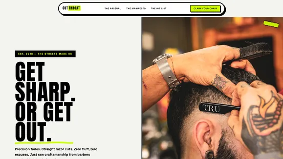
Cut Throat Cartel
A neo-brutalist, high-contrast Astro template built for barbershops, tattoo parlors, and raw streetwear brands that want to make an unapologetic statement.
View template