Features
- Asymmetric Hero Layout
- Sticky Scroll Narrative
- Bento Grid Portfolio
- Fluid Typography
- Pure CSS/SVG Topographic Backgrounds
- Mobile-Responsive
Included Pages
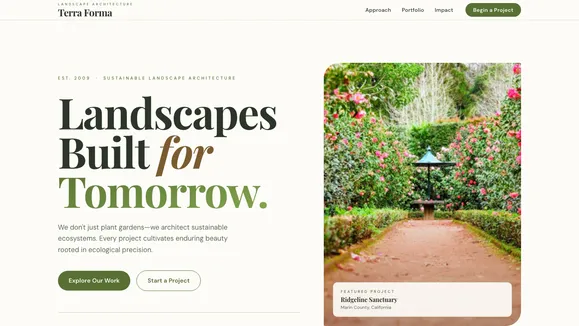
Terra Forma Template
A modern, architectural template designed for sustainable landscaping, environmental engineering, and ecosystem design firms.
Architect Sustainable Ecosystems Online
Terra Forma is not just another landscaping template—it is an authoritative digital foundation for firms that engineer nature sustainably. Designed with a precise, action-oriented tone, this template empowers your brand to move beyond basic lawn care messaging and step into the realm of true ecosystem architecture. The visual archetype is deeply grounded yet highly modern, utilizing an earthy palette of warm alabaster backgrounds, rich olive primary actions, and deep canopy green typography that reduces eye strain while maintaining stark, professional contrast.
Every section of Terra Forma is built to breathe, employing generous vertical padding and rhythmic asymmetrical layouts that guide the user’s eye effortlessly down the page. From the monolithic, fluid typography of the asymmetric hero section to the engaging sticky-scroll narrative of your company’s ethos, this template is designed to evoke trust, architectural precision, and a deep respect for the natural world. It is the perfect digital environment to showcase high-texture, low-saturation imagery of modern hardscaping and native softscaping.
What’s Included
- Asymmetric Hero Layout: Make an immediate impact with a monolithic, stacked fluid headline balanced by an offset, high-impact portrait image that naturally draws visitors down the page.
- Sticky Scroll Narrative: Tell your brand’s story with a sophisticated sticky layout. Your core ethos remains fixed on the left while rich text and supporting imagery scroll past on the right.
- Bento Grid Portfolio: Showcase your best work in a tightly packed, asymmetrical bento box layout. Crisp rounded corners and mixed aspect ratios (square detail shots alongside wide landscape views) create a dynamic, modern gallery.
- Massive Impact Statistics: Strip away the noise with an edge-to-edge, big-type reveal section designed to highlight your most impressive metrics, such as gallons of water saved or acres of land revitalized.
- Pure CSS/SVG Topographic Backgrounds: Enhance depth without sacrificing performance. Terra Forma features an ultra-faint SVG topographic contour background and architectural grid lines, relying entirely on pure CSS rather than heavy JavaScript.
- Liquid Underline Navigation: A bespoke, asymmetrical navigation bar that drops below the standard header line, featuring a smooth, CSS-only liquid underline animation on hover for a premium interactive feel.
- Mobile-Responsive: Flawless execution across all devices, ensuring your fluid typography and complex grid structures adapt perfectly to mobile screens.
Who Is This Template For?
Terra Forma is meticulously crafted for businesses that operate at the intersection of design, engineering, and nature. It is ideal for:
- Landscape Architecture Firms: Showcase complex, high-end residential and commercial projects with an editorial, cinematic flair.
- Sustainable Ecosystem Engineers: Highlight your scientific approach to land management, water conservation, and native planting.
- High-End Hardscaping Companies: Present your concrete, wood, and stone masonry work within a highly structured, modern digital framework.
- Environmental Consultants: Establish authority and trust with precise, professional typography and a grounded aesthetic.
- Boutique Eco-Resorts & Retreats: Convey a sense of natural harmony and architectural elegance to prospective guests.
Performance & Technical Excellence
Terra Forma is engineered for exceptional speed and uncompromising accessibility. By eliminating reliance on heavy JavaScript libraries for complex animations, the template achieves its signature depth and interaction entirely through pure CSS and highly optimized inline SVGs. The fluid typography system utilizes advanced CSS clamp functions, ensuring perfectly scaled, monumental text on ultra-wide monitors and highly legible, crisp reading experiences on mobile devices.
Furthermore, Terra Forma strictly adheres to WCAG AA accessibility standards. The rich olive primary color and deep canopy green text have been meticulously tested against the warm alabaster background to guarantee a minimum contrast ratio of 4.9:1. All bento card image overlays utilize perfectly calibrated dark gradient scrims, ensuring that your white text remains beautifully legible regardless of the underlying photograph.
Frequently Asked Questions
Can I easily change the color palette to match my brand? Yes. Terra Forma utilizes a centralized CSS variables map. By adjusting the Background, Text, Primary, Accent, and Surface hex codes in the global stylesheet, the entire template will automatically update while maintaining its foundational design logic.
How does the sticky scroll narrative work on mobile devices? On smaller screens where horizontal space is limited, the sticky scroll section gracefully degrades into a standard, stacked vertical layout. This ensures that your narrative remains perfectly readable and accessible without frustrating mobile users.
Do I need to know JavaScript to customize the topographic background? Not at all. The signature topographic lines and architectural grids are built using lightweight, inline SVG patterns controlled entirely by CSS. You can easily adjust their opacity, color, or scale directly in the stylesheet.
What kind of imagery works best with this template? Terra Forma is designed for high-texture, low-saturation photography. It shines when paired with editorial, cinematic images that highlight the interplay of shadows, architectural hardscaping, and native softscaping. Overly vibrant or artificial “stock” greens may clash with the earthy, grounded aesthetic.
Is the fluid typography customizable?
Absolutely. The fluid text is powered by CSS clamp() functions. You can easily adjust the minimum, preferred, and maximum font sizes to suit your specific font choices or brand guidelines, ensuring your headlines always feel monumental without breaking the layout.
Ready to get started?
Use this template as your starting point and customize everything with AI. Your site will be live in minutes.
More templates
Construction & Renovation
Professional template for construction companies, renovation contractors, and home improvement businesses. Features project gallery, services, and quote request forms.
View template
Design Furniture Luxury
Elegant template for high-end furniture stores and luxury interior design showcases. Minimal, gallery-driven layout that lets your products speak for themselves.
View template
Cut Throat Cartel
A neo-brutalist, high-contrast Astro template built for barbershops, tattoo parlors, and raw streetwear brands that want to make an unapologetic statement.
View template