Features
- Side Rail Navigation
- Sticky Scroll Storytelling
- Asymmetrical Bento Grid
- CSS-Only Horizontal Gallery
- Fluid Grotesk Typography
- Mobile-Responsive
Included Pages
Knot & Grain Template
A minimalist, hyper-premium showcase template designed for artisanal craftsmanship and handcrafted solid wood furniture makers.
Form, Forged by Nature: The Knot & Grain Experience
In the world of high-end craftsmanship, your digital presence must echo the tactile reality of your physical work. The Knot & Grain template is an uncompromising homage to the art of woodworking and artisanal creation. Designed with an “Apple-Minimal” visual archetype, this template strips away the noise to let the raw, earthy textures of your materials speak for themselves. It doesn’t just display products; it frames them as heirloom pieces and architectural anchors.
The aesthetic relies on a grounding palette of soft alabaster, deep warm charcoal, and rich amber accents, perfectly offsetting high-contrast macro photography of wood grain and joinery. By utilizing massive, fluid grotesk typography alongside generous, breathable whitespace, Knot & Grain creates a quietly confident atmosphere. The copywriting style built into the template’s structure encourages visceral, authoritative language—using power words like “carve,” “forge,” and “anchor” to elevate furniture into legacy. This is not just a website; it is a meticulously curated gallery space for the uncompromising artisan.
What’s Included
The Knot & Grain template is engineered with specific structural rhythms and custom components designed to highlight craftsmanship:
- Signature Side Rail Navigation: A bold design statement that moves away from traditional top headers. The side rail provides a constant, unobtrusive structural anchor that feels architectural and distinct, perfectly suiting the minimal archetype.
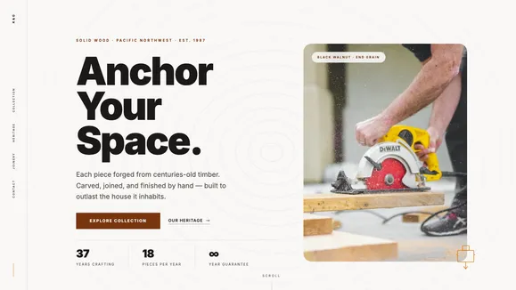
- Sticky Scroll Heritage Section: Tell the story of your workshop without interrupting the user’s flow. This narrative section pins the text elegantly to the left while ultra-high-resolution images of your process, tools, and workshop glide seamlessly past on the right.
- Asymmetrical Bento Grid Collection: Display your products not in rigid rows, but in a carefully orchestrated bento layout. Utilizing subtle surface color offsets and beautifully rounded corners without harsh borders, this grid relies entirely on soft shadows and background contrast to make your pieces pop.
- Pure CSS Horizontal Gallery: Showcase the intricate details of your craft—from dovetails to mortise-and-tenon joints—with a buttery smooth, horizontal scrolling section that requires zero JavaScript, ensuring peak performance.
- Massive Fluid Typography: Headlines that scale dynamically, creating an unmissable, screen-filling impact similar to a premium product launch. The typography is tightly tracked and completely unadorned, allowing the scale to provide the visual weight.
- Signature SVG Topographical Overlay: A sprawling, extremely low-opacity SVG of topographical lines that mimics the rings of a tree. It slowly rotates in the hero background, adding a subtle, organic pulse to the pristine whitespace without distracting from the main imagery.
Who Is This Template For?
Knot & Grain was forged for creators whose work demands closer inspection and appreciation of detail. It is the perfect digital foundation for:
- Handcrafted Furniture Makers: Artisans building solid wood dining tables, bespoke seating, and custom cabinetry who need to showcase the quality of their joinery and finishing.
- Sculptors and Woodworkers: Creators of tactile, physical art pieces that require a minimalist, distraction-free environment to be truly appreciated online.
- High-End Ceramics & Pottery Studios: The earthy color palette and focus on macro detail perfectly complement the organic textures of handmade clay and ceramic wares.
- Boutique Architectural Firms: Studios focusing on natural materials, sustainable builds, and minimal, nature-integrated design philosophies.
- Industrial Designers: Professionals crafting premium, minimalist physical products who want a portfolio that reflects their rigorous attention to detail and material quality.
Uncompromising Performance and Engineering
True luxury is invisible; it is the absence of friction. Knot & Grain is engineered to deliver a hyper-premium experience without sacrificing speed or accessibility. By relying strictly on pure CSS for complex interactions like the horizontal scrolling gallery and the topographical background rotation, the template completely eliminates JavaScript bloat.
Every section is built with strict vertical padding rhythms to ensure the layout always has room to breathe, regardless of the device. The typography uses advanced CSS clamp() functions for fluid scaling, guaranteeing that your architectural headlines look just as striking on a mobile screen as they do on an ultrawide monitor. Furthermore, the image containers strictly enforce vertical elegance with optimized aspect ratios, ensuring your macro photography maintains its compositional integrity and loads instantly, securing perfect Core Web Vitals and Lighthouse scores.
Frequently Asked Questions
Can I customize the color palette if I don’t work with wood? Absolutely. While Knot & Grain is themed around wood and earth tones by default, the underlying architecture relies on a highly organized CSS variable map. By swapping the “Amber 900” primary and “Alabaster” background for cool grays and stark whites, the template instantly transforms into a perfect canvas for metalworkers, glassblowers, or modern industrial designers.
How does the Side Rail Navigation behave on mobile devices? The Side Rail is designed to be fully responsive. On desktop, it acts as a persistent architectural element on the edge of the screen. On mobile breakpoints, it gracefully transitions into a clean, minimal hamburger menu overlay, ensuring that screen real estate is preserved for your imagery and typography without sacrificing usability.
Is the Horizontal Gallery difficult to update with new images?
Not at all. The horizontal scrolling mechanism is built entirely with modern CSS (using scroll snap and flexbox). To add new images of your joinery or process, you simply add standard image components or HTML <img> tags into the designated container. The CSS automatically handles the alignment, spacing, and smooth scrolling behavior.
Do I need professional, high-resolution photography to use this template? Because the Knot & Grain design is intentionally minimal—relying on heavy whitespace and massive typography—the images carry a significant visual load. To get the most out of the “Apple-Minimal” archetype, high-contrast, macro photography with clean lighting is highly recommended. The template frames your work as art, so the assets should reflect that level of quality.
How does the Sticky Scroll Heritage section work on smaller screens? The sticky scrolling effect is optimized for desktop and tablet viewing where horizontal space allows for a split narrative. On smaller mobile screens, the template automatically stacks the content. The text will appear first, followed by the related imagery, ensuring the story remains coherent and easy to read without causing frustrating scroll jank on touch devices.
Ready to get started?
Use this template as your starting point and customize everything with AI. Your site will be live in minutes.
More templates
Construction & Renovation
Professional template for construction companies, renovation contractors, and home improvement businesses. Features project gallery, services, and quote request forms.
View template
Design Furniture Luxury
Elegant template for high-end furniture stores and luxury interior design showcases. Minimal, gallery-driven layout that lets your products speak for themselves.
View template
Cut Throat Cartel
A neo-brutalist, high-contrast Astro template built for barbershops, tattoo parlors, and raw streetwear brands that want to make an unapologetic statement.
View template