Features
- Asymmetric Hero Grid
- Floating Bento Navigation
- CSS Horizontal Scroll
- Big Type Manifesto
- Bento Grid Lookbook
- Mobile-Responsive
Included Pages
Wave Rider Template
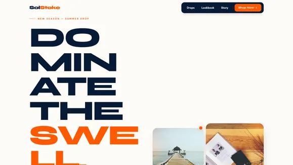
A high-adrenaline, unapologetically bold business template featuring explosive asymmetrical layouts, fluid typography, and vibrant summer energy designed for Gen-Z lifestyle brands.
Shred the Norm: A Template Built for High-Adrenaline Brands
Catch the summer. Wear the energy. The Wave Rider template is an explosive, high-adrenaline digital experience built specifically for brands that refuse to blend into the background. Designed with an unapologetically Gen-Z, marketing-genius tone, this template abandons corporate jargon and stiff layouts in favor of pure, sun-drenched enthusiasm. We engineered Wave Rider to feel kinetic and raw, anchoring its aesthetic in a vibrant palette of Sun-bleached Sand (#fdfbf7), Deep Trench Navy (#061a35), Solar Flare Orange (#ff5900), and Electric Cyan (#00d4ff).
Every section is designed to breathe with generous py-24 to py-32 vertical spacing, allowing your content to float effortlessly down the page. The typography is massive, fluid, and architectural—utilizing ultra-tight tracking on heavily rounded sans-serif headers to demand absolute attention. Combined with soft, wavy topographic lines, absolute-positioned SVG heat waves, and asymmetrical layouts that break out of standard containers, Wave Rider doesn’t just display your products; it thrusts your audience directly into the lineup. Dominate the swell and ignite your brand’s digital presence.
What’s Included
Wave Rider is packed with bespoke, meticulously crafted components that prioritize both aesthetic impact and user engagement. Every layout rhythm is designed to keep the user scrolling, interacting, and converting.
The Floating “Bento Bar” Navigation Instead of a predictable, full-width corporate header, Wave Rider utilizes an Asymmetric Signature navigation. This floating, heavily rounded pill (like a bento box slice) is suspended near the top center of the screen, leaving negative space around it. When users hover over a navigation item, it physically scales up with a bouncy, tactile CSS transition, revealing a vibrant cyan drop-shadow.
Explosive Asymmetric Hero Layout The first impression is everything. The hero section features a massive headline pinned to the lower-left quadrant, intentionally breaking out of standard containers to assert dominance. The upper right counterbalances this with a clustered collage of three overlapping, heavily rounded images floating via CSS transforms. Backed by a massive, blurred “Heat Wave” electric cyan-to-orange radial gradient, it creates an immediate glowing “sun” effect.
Horizontal Sticky Scroll Product Gallery
Showcase your seasonal drops with a dynamic side-scrolling timeline. As users scroll vertically down the page, the products move horizontally. We built this entirely with native CSS snap points (overflow-x-auto), ensuring a buttery smooth experience without any heavy JavaScript scroll-hijacking.
Big Type Brand Manifesto Assert your brand’s dominance with a full viewport section dedicated to a single, massive fluid text block. Set against a dark Deep Trench Navy background, the Solar Flare Orange text creates a punchy, high-contrast visual break that forces the user to read your core message.
Bento Grid Lookbook
A tightly packed, unordered grid of varied-size cards (squares, vertical rectangles, horizontal pills) that perfectly frames your lifestyle shots and product close-ups. With heavily rounded 3xl corners, this bento layout feels modern, organized, yet playfully chaotic.
Who Is This Template For?
Wave Rider is specifically architected for businesses and creators who rely on high-impact visuals and an energetic brand voice. If your brand is loud, proud, and kinetic, this template is your perfect match.
- Action Sports & Surf Brands: Perfect for companies selling surfboards, skateboards, wakeboards, and related hardware.
- Gen-Z DTC Apparel & Swimwear: Ideal for vibrant lifestyle clothing, neon pop swimwear, and streetwear lines.
- High-Energy Event Organizers: A great fit for summer music festivals, beach pop-ups, and extreme sports competitions.
- Outdoor Lifestyle Startups: For brands that want to communicate adventure, sun-drenched travel, and raw kinetic energy.
- Creative Agencies: A stunning starting point for agencies wanting to showcase a bold, convention-breaking portfolio.
Built for Speed: Technical Excellence Under the Hood
While Wave Rider looks incredibly complex and animation-heavy, it is engineered for ruthless performance. We deliberately avoided bloated JavaScript libraries. The horizontal product scroll, the bouncy navigation scale effects, and the floating bento layouts are all achieved using modern, native CSS features like CSS Grid, clamp() for fluid typography, and CSS scroll snap points.
Furthermore, this template strictly adheres to WCAG AA accessibility standards. The Deep Trench Navy text on the Sun-bleached Sand background provides a comfortable contrast ratio well above 4.5:1. When text is placed over our aggressive Solar Flare Orange or Electric Cyan accents, it automatically shifts to pure Deep Trench Navy or pure White to guarantee maximum legibility. You get explosive visual design without sacrificing accessibility, SEO rankings, or Lighthouse performance scores.
Frequently Asked Questions
Can I tone down the neon colors if my brand is a bit more subtle? Absolutely. The entire color system is mapped to global CSS variables. By simply changing the hex codes in the Theme Variables Map, you can instantly transform Wave Rider from a neon summer explosion into a moody, minimalist layout or a warm, earthy brand experience. The asymmetric layouts and fluid typography look incredible with any high-contrast palette.
How does the massive typography handle mobile devices?
We use modern CSS clamp() functions for all display typography (e.g., text-[clamp(3rem,8vw,8rem)]). This means the massive, architectural headlines smoothly scale down to fit perfectly on a mobile screen without causing horizontal overflow or broken layouts. You get maximum impact on desktop and perfect readability on mobile.
Does the CSS-only horizontal scroll work on all browsers?
Yes. By utilizing native CSS overflow-x-auto combined with CSS scroll snap points, the horizontal product scroller is supported by all modern browsers (Safari, Chrome, Firefox, Edge). Because it doesn’t rely on JavaScript scroll-hijacking, it performs flawlessly on mobile touchscreens and feels native to the user’s device.
Are the heavily rounded corners and masked images difficult to manage?
Not at all. The aspect ratios and heavily rounded corners (rounded-3xl and rounded-full) are handled automatically by Tailwind utility classes applied to the image containers. You simply upload your standard photography, and the template’s CSS masks and frames them perfectly into the bento grids and asymmetric collages.
Is the floating “Bento Bar” navigation accessible for screen readers?
Yes. While the navigation breaks visual conventions by floating as a suspended pill, its underlying HTML structure remains standard semantic <nav> and <ul> tags. The bento bar is fully keyboard navigable, and the tactile hover effects are achieved purely through CSS transforms, ensuring no accessibility tools are confused or blocked by the design.
Ready to get started?
Use this template as your starting point and customize everything with AI. Your site will be live in minutes.
More templates
Construction & Renovation
Professional template for construction companies, renovation contractors, and home improvement businesses. Features project gallery, services, and quote request forms.
View template
Design Furniture Luxury
Elegant template for high-end furniture stores and luxury interior design showcases. Minimal, gallery-driven layout that lets your products speak for themselves.
View template
Cut Throat Cartel
A neo-brutalist, high-contrast Astro template built for barbershops, tattoo parlors, and raw streetwear brands that want to make an unapologetic statement.
View template