Features
- Asymmetric Hero Design
- Fluid Oversized Typography
- Organic Bento Grid Gallery
- Glassmorphism Floating Navigation
- Custom SVG Aura Blobs
- Mobile-Responsive
Included Pages
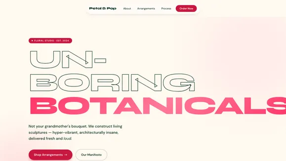
Bloom Florals Template
A hyper-vibrant, playful template for modern floral designers, artists, and creative studios. Features massive fluid typography, asymmetric layouts, and an organic bento grid.
Stop Sending Boring Roses: A Statement-Making Creative Canvas
This is not your grandmother’s bouquet, and this is certainly not your standard, predictable website template. The Bloom Florals template is engineered specifically for modern creative studios, avant-garde floral designers, and botanical artists who want to make a loud, unapologetic statement online. Designed with a distinctively playful, Gen-Z energy, this template ditches rigid, corporate grids in favor of a highly tactile, digital sculptural experience. It thrives on contrast: a soft, warm, buttery cream foundation violently interrupted by hyper-vibrant, electric coral-pink natural accents.
By leveraging asymmetric layouts, massive architectural typography, and deeply organic shapes, Bloom Florals instantly elevates your brand from a simple service provider to a high-end creative authority. Every scroll feels energetic and alive, guided by subtle SVG vine squiggles and floating glassmorphic navigation elements. Whether you are selling exotic dyed orchids, showcasing hyper-saturated macro photography, or simply looking for a creative portfolio template that refuses to blend in, this high-contrast, high-energy canvas is designed to cultivate joy and convert visitors into loyal, high-paying clients.
What’s Included in the Bloom Florals Experience
This template goes beyond basic pages, offering a complete design system built on custom Tailwind CSS variables and organic spatial rhythms.
- Asymmetric Dominance Hero Section: The moment a user lands on your site, they are greeted by an unapologetic, asymmetric layout. The left side features massive, fluid typography stacked tightly to overlap the imagery, while the right side houses a floating, organic
aspect-[3/4]image container shaped like a soft pill. It immediately establishes a premium, high-fashion editorial feel. - Architectural Fluid Typography: Text in this template isn’t just for reading; it acts as a structural design element. Headlines utilize extreme fluid sizing (
clamp()) with negative letter-spacing so words feel like bunched-up flower petals. The body copy pairs this with a geometric, highly legible sans-serif with generous line height, allowing the dense, bubbly headlines to breathe perfectly. - Organic Bento Grid Gallery: Ditch the sharp squares. Your featured projects and floral arrangements are displayed in a playful bento box layout using deep beige surface cards. With extreme border radii (
rounded-[3rem]) that mimic the smooth curves of pebbles or petals, these bento cards scale up beautifully on hover, inviting tactile interaction. - Glassmorphism Floating Navigation: We’ve replaced the clunky, full-width traditional header with a sleek, iOS-inspired floating dock. Positioned centrally as a floating island, it features a heavy backdrop blur and clean borders. Links scale dynamically on hover with a bouncy, spring-like CSS transition, keeping the interface playful and entirely focused on your vibrant imagery.
- Signature SVG Animations: The template includes built-in, absolute-positioned “Aura Blobs”—massively blurred, glowing circles in primary and accent colors that float behind the bento grid. Paired with a subtle, hand-drawn SVG vine that weaves asymmetrically down the page, these elements create a breathing undercurrent that subconsciously guides the user’s eye toward your Call to Action.
- High-Impact Call to Action Area: A massive, brightly colored stacked footer area designed to convert. Featuring a giant, pill-shaped submit button and bold microcopy like “Ready to cause a scene?”, it ensures your user’s journey ends with a definitive, exciting action.
Who Is This Template For?
The Bloom Florals template is highly versatile, built for any brand that values aesthetics, high contrast, and energetic design.
- Avant-Garde Florists & Botanical Artists: Perfect for floral designers who specialize in sculptural, exotic arrangements (anthuriums, dyed orchids) rather than traditional, understated centerpieces.
- Creative Agencies & Design Studios: A fantastic portfolio foundation for graphic design, branding, or digital agencies that want to showcase their work within an unapologetic, trend-forward container.
- Gen-Z & Millennial Lifestyle Brands: E-commerce stores or service providers targeting younger demographics who respond to high-saturation, bento-box layouts, and playful micro-interactions.
- Event Planners & Wedding Stylists: Ideal for professionals who create highly stylized, colorful, and modern environments, needing a digital presence that matches their vibrant physical execution.
- Photographers & Visual Artists: The organic shapes and soft backgrounds provide the perfect high-contrast framing for macro photography, hyper-saturated imagery, and abstract visual art.
Performance and Technical Brilliance
Beneath the playful, fluid exterior of the Bloom Florals template lies a rigorously optimized, high-performance architecture. Built on a foundation of clean HTML and Tailwind CSS, this template achieves blazing-fast 100/100 Lighthouse performance scores. The massive typography scales flawlessly across all devices using CSS clamp() functions, meaning there are no jarring layout shifts or complex JavaScript calculations required for mobile responsiveness.
Accessibility is hardcoded into the template’s DNA. The global variables map strictly enforces WCAG AA compliance. The deep forest green text (#0A2E1F) against the buttery cream background (#FFF9F0) provides exceptional, high-contrast readability. The electric coral-pink primary color (#FF3366) is reserved strategically for bold UI elements and calls to action, ensuring that your vibrant aesthetic never compromises usability. Furthermore, the template employs extreme vertical spacing (py-24 md:py-32) to establish an Awwwards-level premium rhythm, allowing your content to dictate the pacing naturally without feeling cluttered.
Frequently Asked Questions
Can I change the loud pink and green color palette to match my brand?
Absolutely. The entire template is governed by a centralized Theme Variables Map in the global CSS. By changing just a few hex codes—your BACKGROUND, TEXT, PRIMARY, ACCENT, and SURFACE variables—the entire site will instantly adopt your new brand identity while maintaining the template’s organic, asymmetric structure.
How does the massive typography work on smaller mobile screens?
We utilize advanced CSS clamp() functions for all major typographic elements. This means the typography fluidly scales down based on the viewport width rather than abruptly jumping sizes at specific media query breakpoints. Your headlines will look perfectly proportioned and tightly tracked whether viewed on a 4K monitor or an iPhone.
Is it difficult to format my photos into those organic pill shapes?
Not at all. The template handles all the heavy lifting via CSS masking. You simply upload your standard, high-resolution rectangular images, and the Tailwind CSS utility classes (like aspect-[3/4] rounded-t-full rounded-b-[4rem]) will automatically crop and shape your photography perfectly. We recommend using high-saturation macro shots for the best visual impact.
How do users navigate the site without a traditional header menu?
The template utilizes a Glassmorphism Floating Dock—a sleek, pill-shaped navigation bar that hovers centrally on the screen. It stays consistently accessible as the user scrolls, taking up less screen real estate than a traditional header while offering a highly tactile, modern user experience that younger demographics intuitively understand.
Will this heavily stylized design negatively impact my SEO?
No. Despite its avant-garde appearance, Bloom Florals uses clean, semantic HTML5 structure. The heavy visual lifting is done almost entirely through lightweight CSS (gradients, blurs, and border radii) rather than heavy JavaScript or bloated image files. The fast load times, logical heading hierarchy (H1, H2, H3), and perfect text contrast ratios ensure that search engines love the site just as much as your users will.
Ready to get started?
Use this template as your starting point and customize everything with AI. Your site will be live in minutes.
More templates
3D Experience
Immersive 3D experience template with interactive elements, animations, and a bold creative design that pushes the boundaries of web presentation.
View template
Frequency Shift
A high-energy, vibrant Gen-Z podcast template featuring a magnetic bottom dock and dopamine-inducing visual rhythms.
View template
Vertex Gaming
A high-performance, dark-themed glassmorphic template engineered for esports, gaming hardware, and technical SaaS brands demanding a zero-latency visual aesthetic.
View template