Features
- Side-Rail Navigation
- Bento Grid Layout
- CSS Horizontal Gallery
- Masonry Image Archive
- Fluid Editorial Typography
- Mobile-Responsive
Included Pages
Clay & Kiln Template
An earthy, ultra-minimal Astro template engineered for tactile artisans, featuring a unique side-rail navigation, editorial typography, and immersive bento grid galleries.
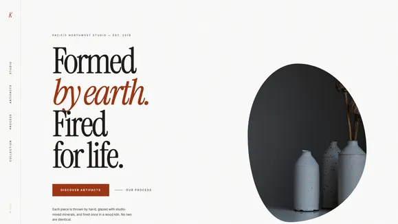
Formed by Earth, Fired for Life: An Editorial Masterpiece
Welcome to the Clay & Kiln template, an ultra-minimal, “Apple-meets-Atelier” digital showcase designed specifically for creators of tactile, heirloom-quality artifacts. In a web saturated with rigid templates and sterile corporate designs, Clay & Kiln stands apart by prioritizing architectural whitespace, deep terracotta accents, and a soft, gallery-wall off-white canvas. This template is engineered to make your physical work feel monolithic, heavy, and undeniably premium.
By embracing aggressive fluid typography and bleeding-edge macro photography masks, Clay & Kiln transforms your website into a high-end editorial magazine. Every section is governed by strict spatial rhythms—utilizing generous padding to give your imagery the room it needs to breathe. Whether you are highlighting the raw texture of unbaked clay, the organic topographical variations of a custom glaze, or the sprawling cinematic shots of your studio process, this template ensures your digital presence is as meticulously crafted as the objects you shape by hand. Elevate your daily rituals, anchor your brand in grounded aesthetics, and discover a digital showcase fired for life.
What’s Included
The Clay & Kiln template is packed with bespoke layout architectures and CSS-driven interactions designed to captivate visitors without relying on heavy JavaScript payloads.
- Signature Side-Rail Navigation: Breaking away from traditional top-bar menus, this template features a “Magazine Spine” navigation pinned to the extreme left viewport edge. Typography is rotated to read bottom-to-top, creating a stark, borderless, and memorable design statement. On hover, a purely CSS-driven liquid underline smoothly expands to indicate interactivity.
- Editorial Split Hero Layout: A commanding 60/40 split immediately arrests the user’s attention. The left column houses massive, bottom-anchored fluid serif typography that scales seamlessly across devices. The right column is reserved for a towering, bleeding-edge portrait photograph constrained by a soft, flat editorial mask—perfect for extreme macro shots of your signature pieces.
- Asymmetrical Bento Grid Artifacts: Showcase your newest collections or featured products using a meticulously balanced bento grid. This asymmetrical arrangement mimics an organic, real-world table layout, allowing you to mix square and portrait imagery seamlessly without feeling boxed into a rigid corporate structure.
- Cinematic Horizontal Process Gallery: Tell the story of your craft with a pure CSS
scroll-snap-xhorizontal gallery. Users can intuitively swipe through wide-aspect studio shots, bringing the visceral experience of the potter’s wheel and the raw clay directly to their screens. - Masonry Collection Archive: Ditch the monotony of standard product grids. The archive section utilizes a staggered vertical masonry rhythm, perfectly suited for mixing varying aspect ratios of macro-photography and deep-focus product shots.
- Subtle SVG Architectural Decorations: The design is elevated by structural background elements that subtly break the grid, including ultra-thin continuous line contours and heavily scaled abstract topographical “thumbprints” that add texture without distracting from your content.
Who Is This Template For?
Clay & Kiln is specifically tailored for artisans and brands that rely on visual weight, texture, and a premium, minimalist aesthetic. It is the perfect foundational blueprint for:
- Ceramicists & Pottery Studios: The earthy color palette (Terracotta, Stone, Raw Umber) and macro-photography focus are purpose-built for showcasing glazes, wheel-thrown forms, and kiln-fired artifacts.
- Sculptors & 3D Fine Artists: The monolithic typography and gallery-like whitespace provide a sophisticated backdrop that doesn’t compete with complex three-dimensional art.
- Artisanal Homeware Brands: Perfect for boutique lifestyle brands selling handcrafted decor, woven textiles, or bespoke wooden furniture who want an editorial catalog experience.
- High-End Craft Workshops: Studios offering masterclasses or behind-the-scenes access will benefit immensely from the horizontal process gallery and immersive storytelling layout.
- Creative Boutiques & Design Agencies: Any agency looking for a stark, brutalist-yet-warm showcase template that breaks traditional navigation patterns to stand out in a crowded market.
Technical Excellence & Performance Benefits
Underneath its artistic exterior, Clay & Kiln is a powerhouse of modern web engineering. Built on the Astro framework, it ships with zero JavaScript by default, ensuring immediate load times and perfect Core Web Vitals. The layout heavily utilizes modern CSS capabilities—such as clamp() for fluid typography that scales dynamically between mobile and 4K desktop screens without writing dozens of brittle media queries.
Furthermore, performance-heavy interactions like the horizontal process gallery and the fluid navigation underlines are executed entirely via CSS transitions and scroll-snap modules. This keeps the main thread completely unblocked. The template also adheres strictly to WCAG AA accessibility standards; the grounded off-black (Stone 900) and deep terracotta accents provide maximum readability against the warm Stone 50 background, ensuring your premium aesthetic is fully accessible to all users.
Frequently Asked Questions
Does the side-rail navigation work well on mobile devices?
Absolutely. While the side-rail “magazine spine” is a striking feature on desktop and tablet, the template utilizes responsive design principles to elegantly collapse this into a sleek, accessible mobile drawer menu on smaller viewports, ensuring the user experience remains flawless regardless of device size.
Can I customize the terracotta and stone color palette?
Yes. The entire visual identity of Clay & Kiln is mapped to a centralized CSS variables file (global.css). By changing just a few hex codes—like your primary accent or your background tone—the entire site instantly adapts while maintaining its underlying architectural spacing and contrast ratios.
How do I manage the bento grids and masonry layouts?
The complex bento and masonry layouts are abstracted into simple, reusable Astro components. You can easily add, remove, or reorder images and text blocks by passing standard props or integrating them directly with your preferred headless Content Management System (CMS). The CSS Grid logic handles the complicated asymmetry automatically.
Does this template use heavy animation libraries?
No. To maintain its lightning-fast performance and strictly premium feel, Clay & Kiln relies on native CSS transitions and pseudo-elements. There are no heavy JavaScript animation libraries slowing down your site. The subtle hover effects and liquid underlines are performant, buttery-smooth, and natively supported by all modern browsers.
Are the fonts included out of the box?
The template comes pre-configured to utilize highly legible, premium open-source fonts (like Playfair Display or Instrument Serif for headlines, and Inter for body copy) via optimized Google Fonts loading strategies. However, the typography stack is easily swappable in the configuration files if your brand utilizes custom or premium typefaces.
Ready to get started?
Use this template as your starting point and customize everything with AI. Your site will be live in minutes.
More templates
3D Experience
Immersive 3D experience template with interactive elements, animations, and a bold creative design that pushes the boundaries of web presentation.
View template
Frequency Shift
A high-energy, vibrant Gen-Z podcast template featuring a magnetic bottom dock and dopamine-inducing visual rhythms.
View template
Vertex Gaming
A high-performance, dark-themed glassmorphic template engineered for esports, gaming hardware, and technical SaaS brands demanding a zero-latency visual aesthetic.
View template