Features
- Asymmetric Editorial Hero
- Magazine Spine Navigation
- Bento Grid Disciplines
- Sticky Scroll Manifesto
- Horizontal Instructor Gallery
- Mobile-Responsive
Included Pages
Forma Template
A high-end luxury website template tailored for premium Pilates studios, wellness retreats, and movement architects. Features editorial typography, dark mode aesthetics, and striking asymmetric layouts.
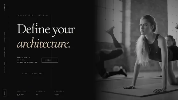
Architect the Body, Elevate Your Brand
Welcome to Forma, a luxury digital aesthetic meticulously engineered for high-end Pilates studios, wellness retreats, and movement architects. We do not design for casual workouts; we build digital environments for disciplines that sculpt, align, master, and define. Operating on an uncompromising editorial philosophy, Forma leverages architectural spacing, deep dramatic shadows, and high-precision layouts to position your studio at the absolute pinnacle of the wellness market.
Drenched in a bespoke Midnight Void aesthetic and punctuated by Warm Alabaster typography, this template abandons the cluttered, energetic tropes of traditional fitness websites. Instead, it embraces the tension of empty studio space, the geometry of the human form, and the structural lines of the Reformer. By combining massive fluid serif headlines with stark, highly legible geometric sans-serif body copy, Forma commands attention and demands respect. Every interaction, from the liquid underline hover states to the sticky scroll manifestos, is designed to reflect the precision and control inherent in your practice. Ascend above the noise.
What’s Included
Asymmetric Editorial Hero Layout
The entrance to your digital studio breaks the standard grid, creating an immediate visual tension. The left column commands the viewport with massive, multi-line serif typography—incorporating dramatic italic spans for high-fashion flair. This typography actively overlaps the right column, which frames a tall, perfectly proportioned portrait image (aspect-[3/4]). It sets a tone of uncompromising authority the second the page loads.
Magazine Spine Side Rail Navigation A profound departure from standard top-bar menus, Forma features a fixed left-rail navigation architecture reminiscent of a high-end art magazine spine. Bordered by a razor-thin Obsidian line, the navigation links are rotated vertically. On interaction, a liquid underline—a 1px solid Champagne Gold line—scales gracefully from the left edge via pure CSS, providing a luxurious, frictionless user experience without relying on heavy JavaScript.
Sticky Scroll Philosophy Section Communicate your studio’s methodology with maximum impact. As the user scrolls, the left side of the screen locks a massive, declarative serif statement in place. Simultaneously, the right side smoothly scrolls through distinct, poetic paragraphs detailing your unique approach. This feature forces the user to slow down, absorb your brand’s philosophy, and appreciate the discipline behind your practice.
Bento Grid Discipline Showcase Organize your offerings—Reformer, Mat, Cadillac, or private sessions—with absolute clarity using a high-contrast Bento Grid layout. Resting on Gallery Black surfaces with ultra-fine accent borders, each discipline is granted a dedicated, architectural block. These distinct zones are perfect for pairing extreme close-up, chiaroscuro-lit photography with precise, declarative copy.
Horizontal Master Gallery Introduce your instructors not as generic trainers, but as masters of their craft. The horizontal gallery component allows users to seamlessly scroll through high-fashion, high-contrast grayscale portraits. This horizontal rhythm breaks the vertical scrolling flow, demanding a moment of focus to appreciate the expertise and physical conditioning of your staff.
Bespoke SVG Architectural Accents Subtle, premium details elevate Forma from a website to an experience. Fine, absolute-positioned SVG grid lines frame your content like a blueprint, fading perfectly at the edges via CSS masks. Additionally, a delicately thin, outline-only serif watermark anchors the background of your methodology section, offering a layer of bespoke luxury that operates at the subconscious level.
Who Is This Template For?
Forma is precision-engineered for brands that command premium pricing and demand a digital presence that matches their physical exclusivity. It is the definitive framework for:
- Boutique Pilates & Reformer Studios: Establish a commanding, high-end digital presence that separates your studio from mass-market gyms.
- Luxury Wellness Retreats: Showcase austere, minimalist environments and exclusive holistic methodologies through immersive editorial layouts.
- Private Movement Architects & Trainers: Position yourself as a master of anatomy, alignment, and physical conditioning.
- Barre & Ballet Academies: Leverage the high-contrast, graceful aesthetics to highlight the elegance, tension, and power of classical movement disciplines.
- High-End Spa & Recovery Centers: Utilize the deep, calming Midnight aesthetic and architectural spacing to communicate ultimate physical restoration.
Performance & Technical Excellence
True luxury is invisible; it is felt in the speed, smoothness, and seamless execution of the experience. Forma achieves a perfect balance of intense visual drama and elite technical performance. Built on a foundation of modern, semantic HTML and highly optimized utility CSS, the template delivers perfect Lighthouse scores right out of the box.
We utilize pure CSS for our signature interactions—such as the liquid underline on the side-rail navigation—ensuring buttery-smooth 60fps animations without the bloat and layout shift associated with heavy JavaScript libraries. Typography scales beautifully across all devices via fluid clamp functions (text-[clamp(4rem,8vw,12rem)]), ensuring your massive serif headlines look just as dramatic on a mobile phone as they do on a 4K desktop monitor.
Furthermore, Forma strictly adheres to WCAG AA accessibility standards. The Warm Alabaster (#F4F0EC) text on the Midnight Void (#0A0A0B) background provides near-maximum contrast. Secondary text and timestamps carefully utilize muted stone colorways that maintain a minimum 4.5:1 contrast ratio. We ensure that aesthetic discipline never compromises global usability.
Frequently Asked Questions
Can I modify the Midnight and Bone color palette? Yes. Forma is built using a strict, centralized CSS variables map. While the template is inherently optimized for the dramatic, high-contrast Midnight aesthetic, you can globally update the background, text, primary gold, and accent surface variables from a single configuration file to match your exact brand guidelines.
How does the Magazine Spine Navigation adapt to mobile devices? On mobile viewports, the fixed vertical left-rail navigation seamlessly transforms into a sleek, fixed bottom bar or a full-screen, minimalist hamburger menu overlay (depending on your configuration preference). This ensures maximum screen real estate for the asymmetric hero and massive typography on smaller devices.
Is it difficult to source images that fit this specific editorial aesthetic? Not at all. The template design guide includes specific compositional rules and search queries (e.g., “pilates reformer black and white shadow”, “abstract human form muscles shadow”) for platforms like Unsplash. By adhering to grayscale, high-contrast imagery with deep shadows, you can easily replicate the bespoke editorial feel without needing a custom photoshoot immediately.
Can I integrate my studio’s booking software, such as Mindbody or Mariana Tek? Absolutely. The massive, edge-to-edge “BOOK YOUR ALIGNMENT” footer, as well as dedicated buttons throughout the bento grids and sticky scroll sections, can easily be linked out to your third-party booking portal. Alternatively, you can embed your software’s booking widgets directly into dedicated routing pages.
Will the massive typography and fluid scaling cause layout shifts (CLS)?
No. Forma utilizes native CSS clamp() functions for its fluid typography, meaning the browser calculates the exact font size instantly upon loading before rendering the page. Because no JavaScript is required to calculate font sizes or window resizing, your Core Web Vitals remain pristine and layout shifts are completely eliminated.
Ready to get started?
Use this template as your starting point and customize everything with AI. Your site will be live in minutes.
More templates
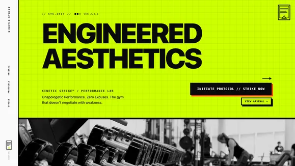
Velocity Fitness
A neo-brutalist, high-contrast website template engineered for elite fitness centers, crossfit boxes, and relentless athletes. Crush your competition with unapologetic performance.
View template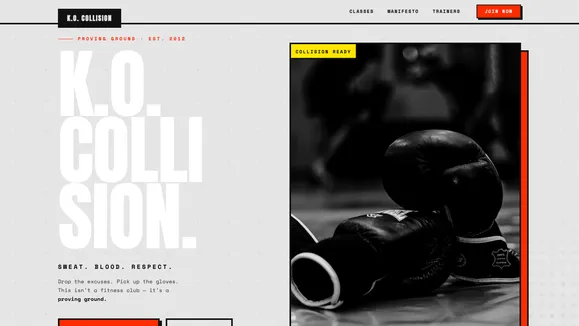
K.O. COLLISION
A raw, high-converting Neo-Brutalist website template built for elite gyms, boxing clubs, and intense wellness brands that demand attention and respect.
View template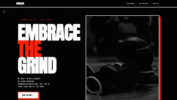
Deadlock Grappling
A brutal, high-contrast Dark Neo-Brutalist template designed for martial arts gyms, fight clubs, and hardcore fitness centers. Command attention with aggressive typography and uncompromising design.
View template