Features
- Asymmetric Hero Layout
- Sticky Scroll Philosophy Section
- Horizontal Menu Gallery
- Bento Grid Pre-Order CTA
- Glass Dock Navigation
- Mobile-Responsive
Included Pages
Artisan Bakery Template
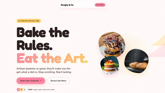
A high-energy, vibrant, and playful website template for modern bakeries, cafes, and sweet shops. Features bold typography, dynamic scrolling, and a conversion-focused bento grid.
Bite Into Pure Joy with the Artisan Bakery Template
Stop scrolling and start tasting. The Artisan Bakery template (codenamed Doughy & Co.) is meticulously crafted for modern culinary creators who categorically refuse to blend into the background. Designed with an audaciously playful, Gen-Z-inspired aesthetic, this high-energy website template transforms a standard online menu into a tactile, mouth-watering digital experience. We aren’t just selling bread here; we are engineering digital dopamine hits baked in butter.
Featuring massive, fluid, bubbly typography and a hyper-vibrant candy-shop color palette, your brand will exude warmth, confidence, and unapologetic sweetness. From the electric bubblegum pink call-to-action buttons to the soft strawberry milk surface cards, every pixel is strategically designed to make your audience immediately crave your creations. Whether you run a boutique cupcake shop, an artisan sourdough bakery, or a neighborhood café, this template provides the perfect high-contrast, delightfully vibrant canvas to showcase your pop-art-style culinary photography and drive massive online pre-orders.
What’s Included
Asymmetric Hero Layout
Break free from the rigid, boring constraints of traditional web design with a massive, left-aligned fluid headline that dominates the viewport. This is paired with an organic cluster of overlapping, floating pastry images on the right side. Heavy drop shadows (shadow-2xl) make your products physically pop off the screen, creating a dynamic, tumbling visual effect that instantly hooks visitors the moment they land.
Sticky Scroll Philosophy Section
Tell your unique brand story without losing your user’s attention. This section utilizes an engaging sticky scroll format where a massive, pinned headline (like “Butter is our Love Language”) stays perfectly anchored on the left. Meanwhile, beautifully designed, rich descriptive cards featuring extreme rounded corners (rounded-[3rem]) glide smoothly upward on the right, turning your brand philosophy into an interactive journey.
Horizontal Menu Gallery Ditch the standard, endlessly scrolling vertical list. Showcase your finest treats with a bespoke horizontal scrolling gallery featuring massive, perfect-square product cards. Set against soft surface backgrounds, each deliciously oversized card is paired with a violently vibrant primary call-to-action button, successfully turning passive browsing into active, immediate craving.
Bento Grid Pre-Order CTA Drive high-volume conversions with a playfully organized, tightly-packed bento grid layout. Mixing soft-edged rectangles and perfect circles, this highly interactive section beautifully organizes your physical location, opening hours, and a massive “Pre-Order Now” block. It creates a tactile, app-like experience that captures immediate sales effortlessly.
Glass Dock Navigation
Navigate in supreme style with a “Floating Island” glass dock. Positioned dynamically at the top center of the screen, this pill-shaped navigation bar features a heavy backdrop blur (backdrop-blur-xl), delicate translucent borders, and smooth CSS color-fill hover states that bring the entire interface to life without relying on heavy JavaScript.
Mobile-Responsive Design
Every single element—from the massive fluid typography utilizing advanced CSS clamp() functions to the touch-friendly horizontal scrolling galleries—gracefully and automatically scales down. This ensures that your customers get a flawless, app-like ordering experience on their smartphones, allowing them to claim their croissants on the go without an ounce of friction.
Who Is This Template For?
This high-energy, delightfully vibrant template is specifically engineered for food and beverage brands that want to forcefully stand out from the traditional, rustic bakery crowd:
- Modern Bakeries & Cafes: Establishments looking to inject a bold, youthful, and highly interactive Gen-Z vibe into their local digital presence.
- Boutique Dessert Shops: Businesses selling visually striking, colorful treats like heavily glazed donuts, gourmet stuffed cookies, or towering artisanal cupcakes.
- Pop-Up Food Concepts: Transient culinary brands needing a punchy, action-driven, and memorable landing page to generate rapid hype and secure advanced pre-orders.
- Artisan Bread Makers: Traditional bakers who want to cleverly contrast their old-world baking methods with a boldly modern, graphic, pop-art web aesthetic.
- Culinary Creators & Influencers: Digital-first food personalities launching physical product lines who require a website that perfectly matches their vibrant, high-engagement social media energy.
Built for Speed and Complete Accessibility
Underneath the deliciously vibrant, candy-coated exterior lies a rigorously optimized, high-performance engineering foundation. The Artisan Bakery template is explicitly built to load near-instantly, ensuring that your high-resolution, oversaturated studio photography doesn’t negatively impact the user experience. By utilizing modern CSS architecture, fluid clamping for typography, native browser scrolling behaviors, and perfectly optimized aspect-square image masks, we completely eliminate heavy JavaScript dependencies. This results in lightning-fast page speeds and flawless Core Web Vitals.
Furthermore, this template strictly and unapologetically adheres to WCAG AA accessibility standards. The high-contrast color palette intentionally maps the electric pinks and buttery yellows to a rich, dark chocolate text color, guaranteeing that your playful design remains completely readable for all visual abilities. With carefully engineered, highly visible focus states (focus-visible:ring-4) and semantic HTML markup, you can rest assured that your website is perfectly accessible, beautifully combining aesthetic audacity with inclusive, empathetic engineering.
Frequently Asked Questions
Can I easily change the vibrant color palette to match my specific brand? Absolutely. The entire template is built using a global, centralized CSS variable system known as the Theme Variables Map. By simply updating a few hex codes in one configuration file—such as your background, text, primary pink, and accent yellow colors—the entire website will automatically adapt. This ensures your brand is reflected perfectly while still maintaining the template’s playful energy and strict accessible contrast ratios.
How do I replace the signature SVG blobs and background decorations? The unique decorative elements (like “The Melt” dripping header and “The Sprinkles” scattered pattern) are implemented as clean, inline absolute-positioned vectors or modular component files. You can easily swap out the path data with your own brand shapes, modify their fill colors via simple utility classes, or simply delete the components if you prefer a cleaner, more minimalist digital aesthetic.
Does the horizontal scrolling gallery work smoothly on touch devices?
Yes, the horizontal gallery is obsessively optimized for mobile and touch devices. It utilizes native CSS scroll snapping (snap-x snap-mandatory), which allows mobile users to effortlessly and naturally swipe left and right through your beautifully rounded product cards. This method prevents layout shifts and completely avoids the performance hit of clunky, JavaScript-heavy carousel plugins.
Is this template optimized for search engines and local SEO? Yes. Beyond the blisteringly fast load times—which is a major ranking factor—the template includes highly semantic HTML5 tags, proper heading hierarchies, and built-in frontmatter configuration for all your crucial SEO metadata. The massive, fluid, and highly readable typography also guarantees lower bounce rates, which further signals to search engines that your site provides immense value to local searchers.
Do I need advanced coding knowledge to connect the Bento Grid to my ordering system?
No advanced coding or backend knowledge is required. The pre-order Bento Grid is structured using highly intuitive UI components and straightforward utility classes. You can easily swap out the placeholder text, update your shop’s opening hours, and change the CTA button href links to point directly to your preferred point-of-sale system, a third-party delivery app like UberEats or DoorDash, or a simple custom contact form.
Ready to get started?
Use this template as your starting point and customize everything with AI. Your site will be live in minutes.
More templates
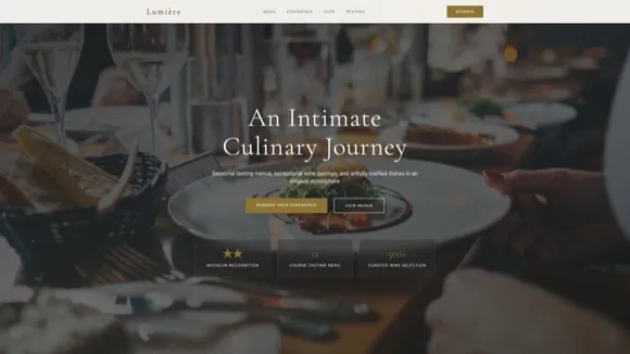
Fine Dining Restaurant
Elegant website template for upscale restaurants and fine dining establishments. Features menu display, reservation system, gallery, and sophisticated dark-themed design.
View template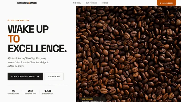
Grindstone & Ember
A tactile, modern website template designed specifically for artisan coffee roasteries, specialty cafes, and premium food brands focusing on sensory experience.
View template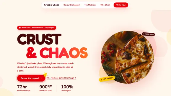
Crust & Chaos
A high-energy, playful Gen-Z restaurant template designed for pizzerias and bold food brands. Features vibrant colors, dynamic scrolling, and a bento grid menu.
View template