Features
- Brutalist Asymmetric Layout
- CSS-Only Marquee Animations
- Bento Grid Menu Layout
- Horizontal Scroll Gallery
- High-Contrast Typography
- Mobile-Responsive
Included Pages
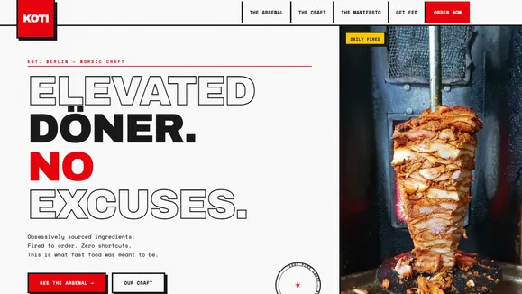
Koti Kebab Template
A brutalist, high-contrast restaurant template designed for urban street food brands that demand an unapologetic and raw digital presence.
Unapologetic. Raw. Pure Fire.
The Koti Kebab template is not your standard, polite restaurant website. Built for urban street food stalls, late-night spots, and culinary rebels, this template relies on a high-octane, brutalist design philosophy. It commands attention with massive, tightly-tracked Grotesk typography, stark Bone White and Charcoal contrasts, and aggressive Harissa Red accents. There are no soft edges here—only hard lines, thick borders, and visceral macro imagery that puts the raw quality of your ingredients front and center.
Designed to mimic the chaotic energy of city streets and the transactional utility of order tickets, Koti Kebab uses monospace fonts and strict geometric constraints to create a sensory, growth-hacker-style digital experience. From the asymmetrical, hanging logo navigation to the kinetic, continuous CSS marquees, every element is engineered to stop the scroll and drive immediate action. This is the perfect digital arsenal for brands that refuse to compromise and want a website as loud and authentic as their food.
What’s Included
- Asymmetric Hanging Navigation: A stark, brutalist header featuring a thick bottom border and a distinctive square logo that breaks out of the navigation bar, overlapping the hero section. Hover states use instantaneous, zero-duration color snaps for a raw, digital feel.
- The Big Type Reveal Marquee: A full-width, CSS-only infinite scrolling marquee that divides sections with kinetic energy, perfect for reinforcing your brand mantras (e.g., “FIRE • MEAT • BREAD • REPEAT”).
- Bento Grid Menu (The Arsenal): A structural, heavy-bordered grid layout with offset solid drop shadows. It perfectly balances massive typography with tight macro shots of ingredients, shifting dynamically on hover to encourage interaction.
- Horizontal Craft Gallery: A CSS-only, side-scrolling snap gallery designed to showcase your prep process or kitchen environment in striking aspect ratios, separated by thick vertical borders.
- The Classic Stack Manifesto: A highly legible, stark two-column layout designed for storytelling, pairing aggressive headlines with dense, monospace paragraphs to communicate your brand’s uncompromising standards.
- Brutalist Calls-to-Action: High-visibility, solid-color buttons with thick borders and hard shadows that demand to be clicked, styled to look like physical industrial hardware.
Who Is This Template For?
The Koti Kebab template is engineered for food and beverage brands that lean heavily into street culture, quality obsession, and bold marketing. It is an ideal fit for:
- Urban Street Food Vendors & Food Trucks: Brands that need a digital presence as fast, loud, and impactful as their physical footprint.
- Late-Night Fast Casual Restaurants: Döner shops, burger joints, and slice houses that cater to a vibrant, high-energy crowd.
- Culinary Rebels & Pop-Ups: Chefs who prioritize raw, unfiltered food experiences over polished, traditional fine dining aesthetics.
- Specialty Butcher Shops & Smokehouses: Businesses that want to highlight the visceral, primal nature of fire and meat through high-contrast macro photography.
- Edgy Direct-to-Consumer Food Brands: Hot sauce companies, spice rubs, or jerky brands looking for a growth-optimized, highly memorable landing page.
Performance & Technical Edge
Beneath the gritty, heavy-metal exterior lies an incredibly optimized, lightweight architecture. The Koti Kebab template achieves its dynamic kinetic energy without relying on heavy JavaScript libraries. The infinite marquee scrolling, horizontal snapping galleries, and instantaneous hover states are all driven entirely by native CSS. This approach ensures lighting-fast load times and perfect Core Web Vitals, crucial for retaining mobile users who are searching for food on the go. The brutalist design ethos—eschewing complex gradients, soft blurs, and excessive DOM nodes in favor of solid colors and structural borders—inherently results in a faster, more responsive website that ranks highly on search engines and converts hungry visitors instantly.
Frequently Asked Questions
Can I tone down the brutalist design if it’s too aggressive for my brand? While the template is built around a loud, unapologetic aesthetic, it is fully customizable. You can easily modify the global CSS to reduce border thicknesses, change the color palette to something more subdued, or swap the heavy Grotesk typography for a softer sans-serif. However, the structural layout is best utilized by brands wanting a bold statement.
How do I update the text in the infinitely scrolling marquee?
The marquee text is a simple HTML element animated via native CSS keyframes. You can update the text directly in the MarqueeDivider.astro component file. Because it relies on CSS rather than JavaScript, it is incredibly lightweight and easy to duplicate for multiple different messages across the site.
Is the side-scrolling gallery easy to use on mobile devices?
Yes. The horizontal gallery utilizes native CSS scroll-snap features. This ensures that on touch devices, users can naturally swipe through your images, and the browser will automatically “snap” each image perfectly into the center of the frame, providing a smooth, app-like experience without any custom scripting.
How are the “instant” hover effects achieved in the navigation?
To fit the raw, transactional theme, we intentionally removed smooth transitions from the navigation links. By setting the Tailwind class duration-0 or transition-none, the background and text colors snap instantly on hover. This is a stylistic choice that mimics old-school digital interfaces and industrial control panels.
What kind of photography works best with this template? Because the design features stark whites, dark charcoals, and thick black borders, your photography needs to be equally aggressive to stand out. We recommend high-contrast, flash-photography style images with deep, hard shadows. Avoid soft, natural-light lifestyle shots; instead, focus on tight, macro close-ups of ingredients, fire, and the cooking process with vibrant, saturated colors.
Ready to get started?
Use this template as your starting point and customize everything with AI. Your site will be live in minutes.
More templates
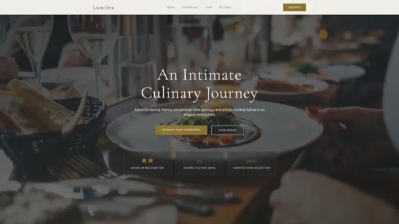
Fine Dining Restaurant
Elegant website template for upscale restaurants and fine dining establishments. Features menu display, reservation system, gallery, and sophisticated dark-themed design.
View template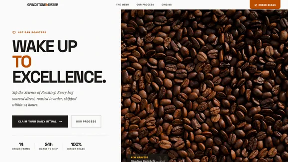
Grindstone & Ember
A tactile, modern website template designed specifically for artisan coffee roasteries, specialty cafes, and premium food brands focusing on sensory experience.
View template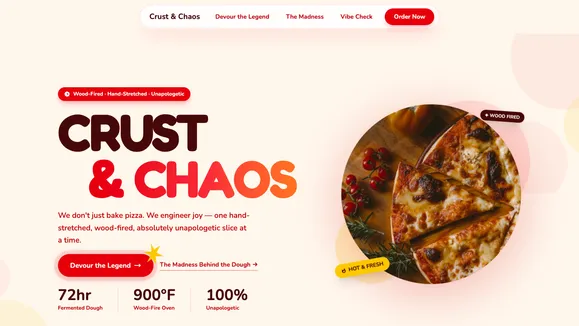
Crust & Chaos
A high-energy, playful Gen-Z restaurant template designed for pizzerias and bold food brands. Features vibrant colors, dynamic scrolling, and a bento grid menu.
View template