Ask an AI website builder for a website and you can usually guess what comes back. A big centred headline, a soft gradient, three cards with icons. It works. It also looks like every other site made the same way.
A small architecture studio and a bouldering gym need very different websites, and most of that difference is design: the typefaces, how the photos are used, how quiet or loud the page feels. So we changed how a new site starts in Pagesmith.
When you create a site, you can now choose See designs first. Pagesmith makes four designs for the top of your homepage, each with its own fonts, colours and layout. You compare them, pick one, and the full website is built in that style.
One brief, four directions
This is a brief we used while testing:
A website for Halden Studio, a small architecture and interior design studio in Helsinki. Show our selected projects, our approach, the team, and a way to start a project with us.
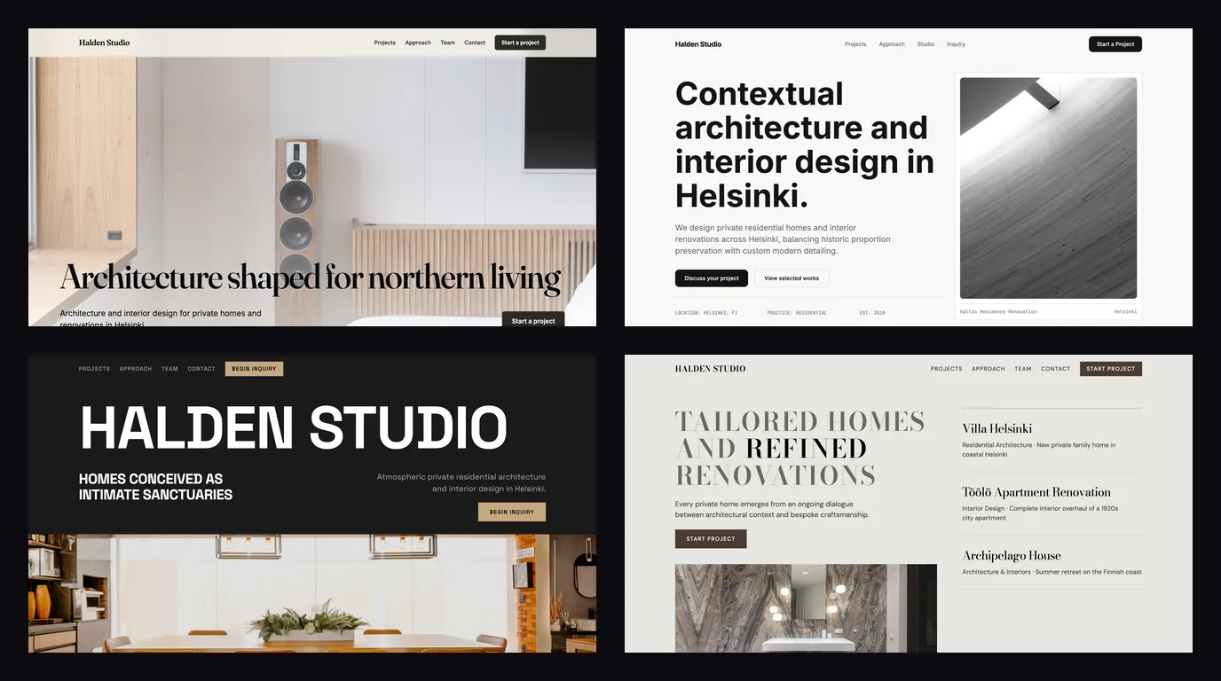
A couple of minutes later, these four designs were ready.
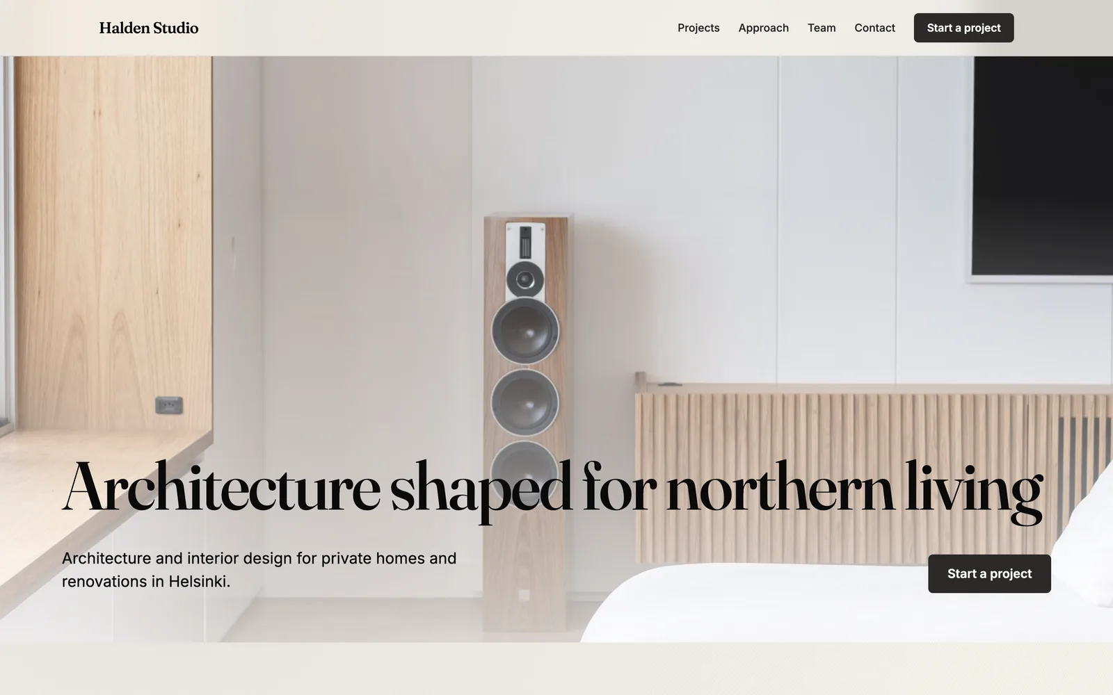
Quiet Materiality. A display serif over a full-width photo of a calm interior. One image does most of the work, which suits a studio whose projects are the selling point.
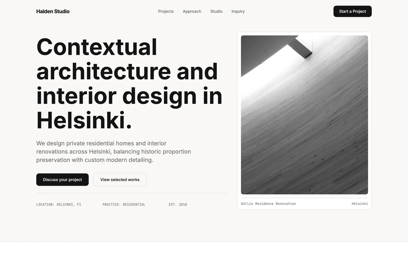
Monograph Index. A strict grid, a heavy grotesk headline and small monospace details for location, practice and founding year. It reads like a printed portfolio.
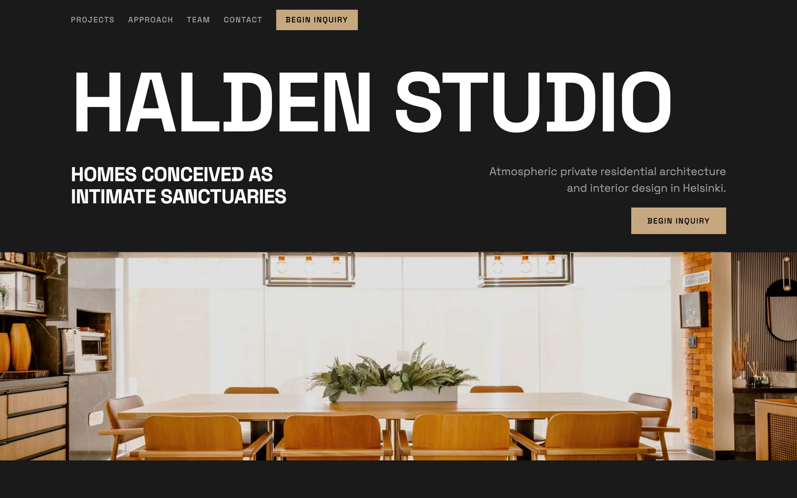
Nordic Nocturne. Oversized type on a dark background with brass accents. Even the button copy changes with the mood: "Begin inquiry".
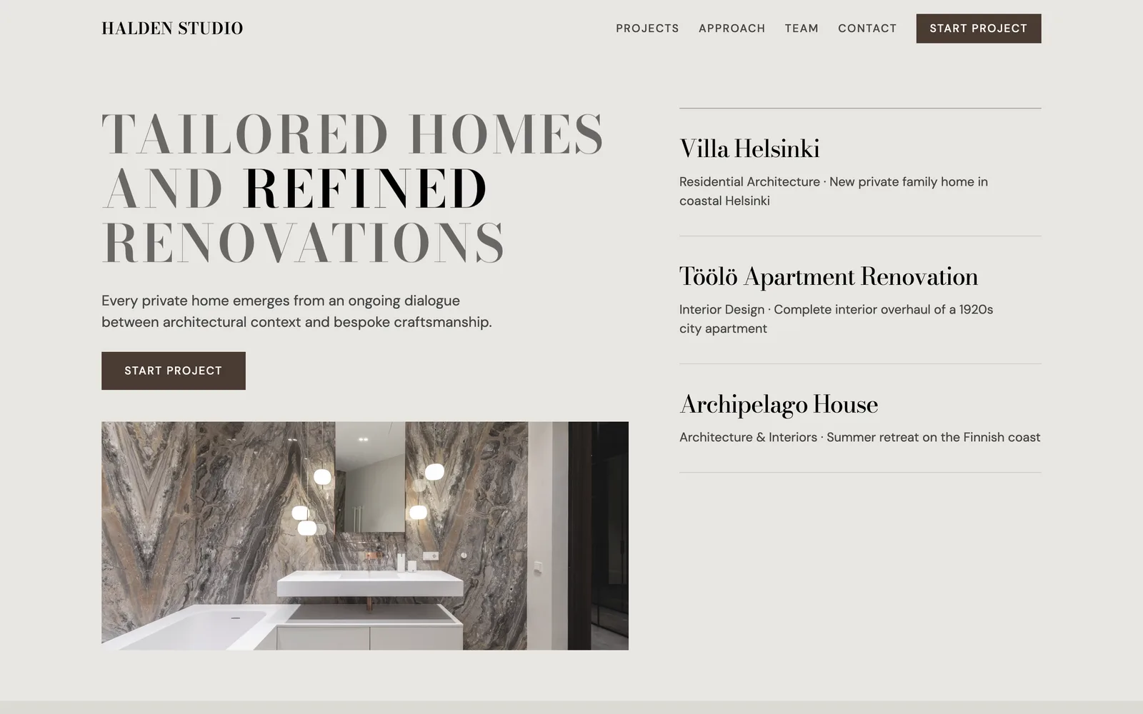
Editorial Context. High-contrast Bodoni-style headlines and an index of projects down the right side, like the contents page of a design magazine.
Same studio, same facts, four websites that would feel quite different to visit. You choose between them before anything is built.
Why the designs hold up
Pagesmith first reads the brief to understand what the business is, where it is, and what visitors should do on the site. Then it plans four directions. Each one commits to a type pairing, a palette, a way of using photos and a layout, and no two designs in a set may share the same navigation or opening layout. So you always compare four different options.
The pages are put together from sections our team designed, and each section comes with its own rules. A price list only appears when there are real prices to show. Opening hours get a large, easy-to-read board for places people visit, like cafés, shops and clinics. Text colours are checked against their backgrounds so everything stays readable.
The result looks like someone made choices, because the system is built to make them.
Different businesses, different websites
Here are designs from three other briefs we ran this week.
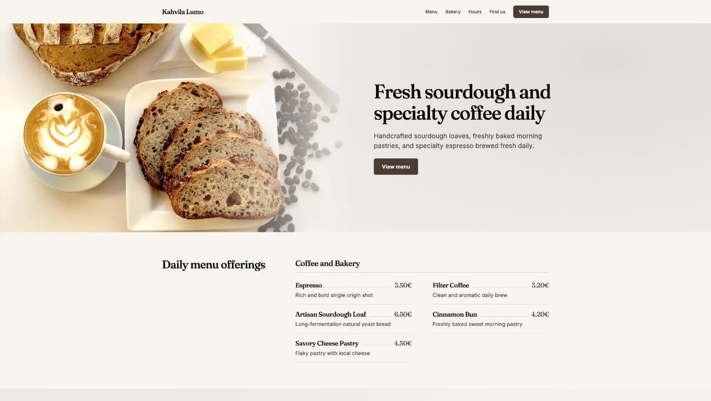
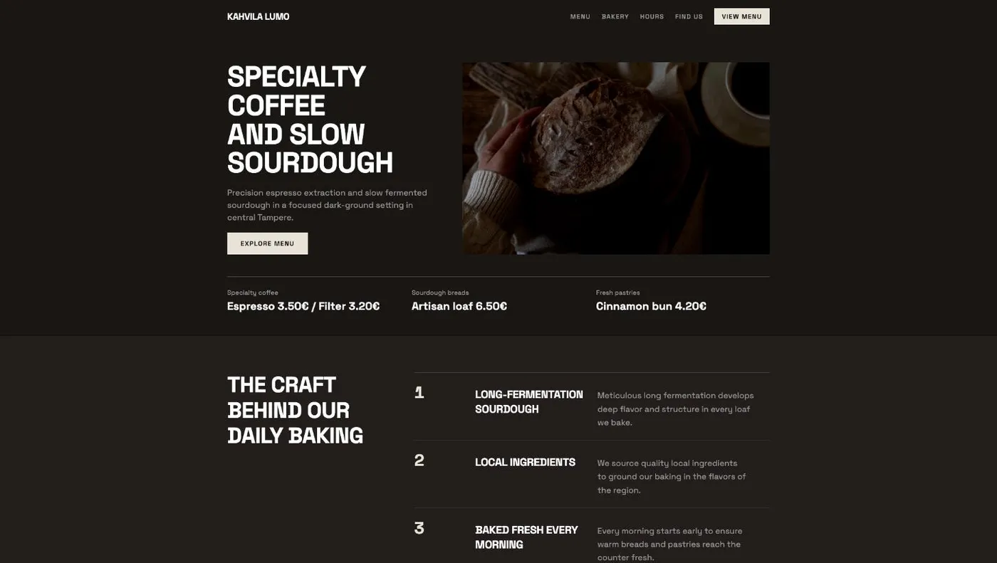
Kahvila Lumo, a café and bakery in Tampere. The first design is warm and bright, with the menu right under the opening. The second is darker and more urban, with prices in a strip under the headline.
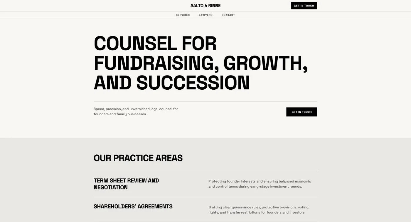
Aalto & Rinne, a law firm in Helsinki. Big confident type, lots of space, and practice areas listed plainly.
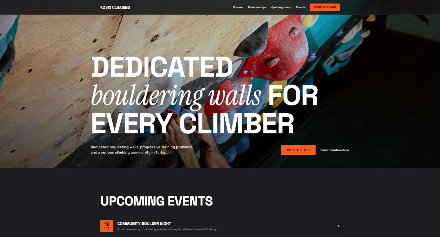
Koski Climbing, a bouldering gym in Turku. A climbing photo across the whole page, bold type mixed with an italic serif, and upcoming events right below.
The café gets a menu. The gym gets events and a booking button. The law firm gets its practice areas. The sections follow what each business needs.
How it works
- Click New site and describe your business in a few sentences. Add photos or brand notes if you have them.
- Choose See designs first.
- Check what Pagesmith understood and confirm the website's language. If a detail would change the designs, you may get one or two quick questions. You can skip them.
- Designs usually take 1 to 3 minutes. You can open one as soon as it's ready.
- Enlarge any design and switch between desktop and phone views.
- Click Build with this design. The full website is ready in 3 to 5 minutes, with the fonts, colours and layout you picked.
If none of the four feel right, edit your description and make a new set.
After the build, it's a normal Pagesmith site. Edit text and images right on the page, ask the AI for new pages or sections, then publish. You can also see designs when you import an existing website and want it redesigned.
Pagesmith fills the designs with believable details so they look finished, like the café's prices above. Before you publish, swap in your real menu, opening hours and contact details, and look through the pages on your phone.
Useful for client work too
If you build websites for clients, four designs give you something concrete to talk about early. "Warm and welcoming" can mean pale backgrounds and quiet type to one person and rich colours and big photos to another. Put the options in front of the client and the conversation gets specific fast. Agree on a direction first, then build.
A few tips for a better brief
- Say what and where. "Architecture studio in Helsinki" gives Pagesmith much more to work with than "a business website".
- Say what visitors should do. Book a table, see the menu, start a project.
- Add your own photos. Designs built around real pictures of your place look like your business.
- Mention brand details you already have, like a colour or a typeface you use everywhere.
Try it
Design previews are included on the free plan. Start for free, describe your business and choose See designs first.