Web Design Patterns for AI Websites That Work
These design patterns can make an AI website clearer and easier to use. Apply them with restraint and test them with your own visitors.
The Goal of Good Design
Design trends come and go, but the goal stays the same: help visitors understand your value and take action.
Visual Style Trends
1) Soft Glass (Frosted Surfaces)
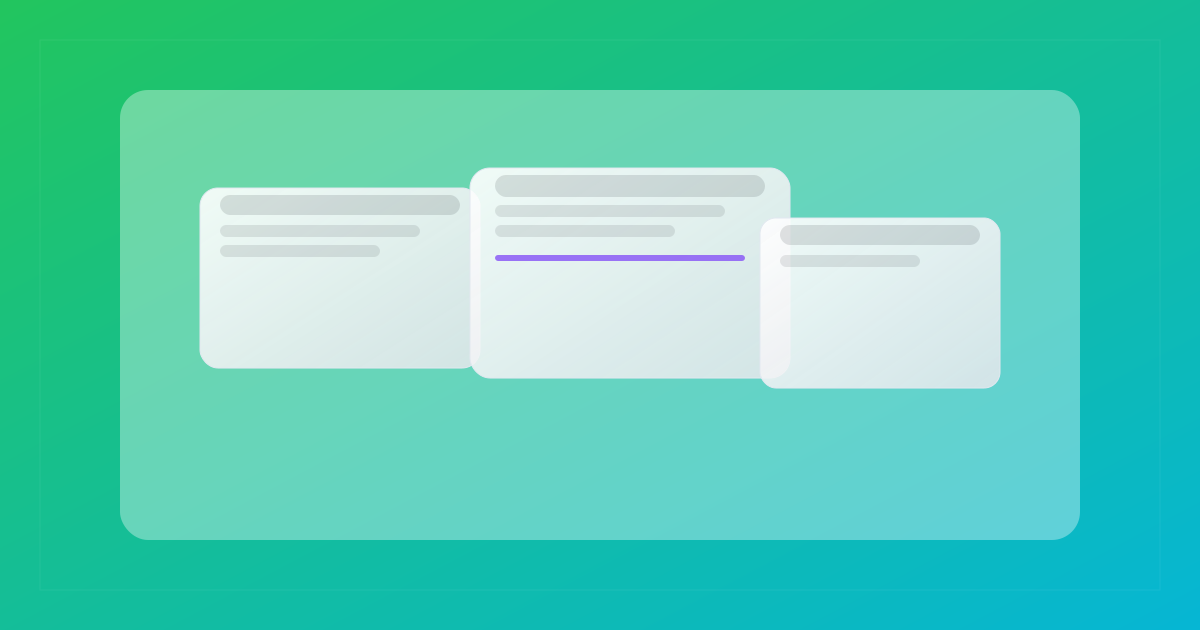
Create depth with translucent panels and light borders. Keep enough contrast between the text, panel, and background.
Why it can help: A separate surface can group related content without adding a solid block of colour.
Where to use it: Hero sections, pricing cards, testimonials, and forms.
2) Gradients as Accents
Use gradients in small doses. They can work in headings, buttons, or dividers, but they do not need to appear in every section.
Why it can help: A controlled accent can draw attention to a heading or primary action.
Where to use it: Page titles, “Get started” buttons, and section separators.
3) Depth Without Heavy 3D
Layered cards and soft shadows can show hierarchy. Detailed 3D scenes often add large assets and more rendering work.
How to use it: Keep shadows subtle and check the page on a low-powered phone before publishing.
Performance First
Visual effects can add assets, scripts, and rendering work. Measure the page after adding them.
Interaction & Motion
4) Micro-interactions
Small responses, such as a button changing state after a click, show that the interface received an action.
Why it works: Confirms action and builds confidence without distracting from the content.
5) Dark Mode
A dark theme can suit the brand or the setting in which people use the site. It needs its own contrast and readability checks.
How to use it: Test text, links, form fields, images, and focus states in both themes. Respect the visitor’s system preference when practical.
Foundation Elements
6) Real, Consistent Imagery
Generated images can work when the style fits the brand and stays consistent across the page. Compress each image and provide useful alternative text where needed.
7) Accessibility by Design
Use visible focus states, readable contrast, descriptive labels, and keyboard-friendly controls from the start.
Check Accessibility Early
Accessibility requirements vary by jurisdiction. Clear text, keyboard support, and usable controls also make the site better for more visitors.
Quick Reference: Where to Apply Each Trend
| Trend | Best Locations |
|---|---|
| Soft Glass | Hero, pricing cards, testimonials |
| Gradients | Headlines, CTAs, dividers |
| Micro-interactions | Buttons, forms, tabs |
| Dark Mode | Site-wide with toggle |
Start Simple
Pick one or two patterns that fit the brand. Add more only when they improve the page.
Pagesmith lets you apply these patterns while editing the page. Check the result at each breakpoint before publishing.