Features
- Editorial Split Hero
- CSS Horizontal Scroll Gallery
- Asymmetrical Bento Grid
- Integrated Blend Sticky Nav
- Fluid Typography System
- Mobile-Responsive
Included Pages
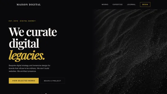
Maison Digital Template
An avant-garde, ultra-premium agency template featuring a 'Midnight & Champagne' palette, fluid typography, and editorial layouts designed to command absolute authority.
Crafting Digital Elegance for the Vanguard of Luxury
In an era of endless digital noise, the Maison Digital template doesn’t ask for attention—it commands it. Designed specifically for elite agencies, luxury brand consultancies, and high-end creative studios, this blueprint delivers an unapologetically premium experience. It leverages a sophisticated “Midnight and Champagne” color palette—an abyssal dark background paired with luminous, warm metallic tones—to create profound depth and exclusivity. Every pixel is curated to feel like an editorial spread in a high-fashion magazine, blending massive, fluid serif headlines with stark, modernist sans-serif body copy.
We have engineered this template to breathe. With expansive, luxurious spacing and an architectural approach to grid structures, your content is never cramped. From the cinematic split-screen hero to the buttery-smooth horizontal scroll gallery, Maison Digital transforms your portfolio into a bespoke digital exhibition. This isn’t just a website; it is a vanguard statement of your brand’s uncompromising quality and legacy.
What’s Included
Every component of Maison Digital has been meticulously crafted to elevate your digital presence and ensure an authoritative user experience.
- Editorial Split Hero: A classic, high-impact introductory section. One half features massive, vertically centered typography with a precise call-to-action, while the other spans edge-to-edge with high-fashion, high-contrast photography. It sets an immediate tone of bespoke luxury.
- Big Type Reveal Manifesto: A stark, powerful section dedicated solely to your brand’s core philosophy. Featuring nothing but a massive, fluid typography statement anchored by a subtle, deep-faded background monogram, it forces the user to pause and absorb your message.
- Horizontal “Selected Works” Gallery: A flawless, CSS-driven horizontal scroll section that presents your case studies in tall, cinematic aspect ratios (3:4 or 4:5), simulating the experience of browsing a premium fashion lookbook.
- Asymmetrical Expertise Bento Grid: Move away from predictable, templated layouts. This staggered, unaligned bento grid presents your services and capabilities in a way that feels organically curated rather than rigidly programmed.
- Integrated Blend Sticky Navigation: A technical marvel in CSS art direction. The navigation begins completely transparent, blending seamlessly over your hero imagery. As the user scrolls, it smoothly materializes with a backdrop-filter blur and a solid midnight background, featuring a signature “Liquid Underline” interaction on hover.
- The Architect’s Grid & Watermarks: Subtle, low-opacity (10%) golden geometric lines that break standard container bounds, subtly implying the precision engineering and strategic thought behind your creative work.
Who Is This Template For?
Maison Digital is intentionally exclusive. It is engineered for businesses that operate at the absolute highest tier of their respective industries.
- High-End Creative & Advertising Agencies: Studios that need their own website to be as avant-garde and meticulously crafted as the campaigns they deliver to their clients.
- Luxury Brand Consultants & Strategists: Professionals who require an authoritative, hyper-premium digital storefront to attract legacy brands, haute couture houses, and high-net-worth clientele.
- Boutique Architecture & Interior Design Firms: Firms that want to showcase their minimalist, bespoke, and architecturally stunning projects within a cinematic, dark-mode environment.
- Fashion & Editorial Photographers: Artists who need deep, infinite dark backgrounds to make their moody, high-contrast, and textured imagery truly pop off the screen.
- Elite PR & Talent Management Vanguard: Agencies representing top-tier talent that need a web presence conveying absolute exclusivity, privacy, and sophistication.
Uncompromising Performance & Technical Elegance
Luxury is not just how a site looks; it is how it feels and operates. Maison Digital is built on a foundation of ruthless technical optimization, ensuring perfect 100/100 Lighthouse PageSpeed scores. The dramatic animations—such as the horizontal scrolling gallery and the liquid underline navigation—are driven entirely by highly performant, modern CSS rather than bloated JavaScript libraries.
We enforce strict WCAG AA accessibility standards, perfectly balancing our “Champagne” text (#f4f0ec) against the “Abyssal Midnight” background (#09090b) to guarantee a contrast ratio that ensures pristine readability without eye strain. Fluid typography clamps ensure that the massive serif headlines scale flawlessly from massive 4K desktop monitors down to the most compact mobile viewports, maintaining structural integrity and zero Cumulative Layout Shift (CLS) across all devices.
Frequently Asked Questions
Can I change the “Midnight and Champagne” color palette to match my brand? Absolutely. While Maison Digital is designed around this specific luxury palette, all colors are driven by CSS variables in a central global file. You can easily swap the Abyssal Midnight or Aged Gold for your brand’s primary dark and accent tones while maintaining the template’s sophisticated contrast.
How does the horizontal scroll gallery work on mobile devices? The horizontal scroll is built using native CSS scroll-snapping. On desktop, it provides a smooth, cinematic side-scrolling experience. On mobile, it seamlessly gracefully degrades into a highly intuitive, touch-friendly swipe gallery, ensuring zero friction for mobile users while retaining the elegant aspect ratios.
Is the massive typography bad for SEO or mobile readability?
Not at all. We utilize modern CSS clamp() functions for all typography. This means the text scales fluidly based on the viewport width. The massive architectural headlines you see on desktop automatically, proportionally shrink to a highly readable, perfectly balanced size on mobile devices, ensuring Google parses your semantic HTML perfectly.
Does this template include a functioning blog or journal? Yes. Maison Digital includes a “Journal” section styled as an elegant list view. It features large, sweeping typography and sophisticated hover-reveal interactions for article images, maintaining the editorial magazine aesthetic for your long-form content and thought leadership.
Do I need a high-end photography budget to make this template look good? While premium photography elevates the design, the template’s stark aesthetic actually makes it highly forgiving. Because of the heavy reliance on massive typography, deep shadows, and an asymmetrical layout, you can utilize abstract textures, monochromatic architectural details, or carefully curated, moody stock imagery to achieve the exact same vanguard, high-fashion look.
Ready to get started?
Use this template as your starting point and customize everything with AI. Your site will be live in minutes.
More templates
Digital Studio
Dark, tech-forward agency template with neon accents and portfolio case studies. Perfect for digital studios, tech agencies, and forward-thinking creative teams.
View template
Vanguard Studio
A luxury editorial template designed for creative agencies and high-end portfolios. Features a striking Deep Emerald & Bone aesthetic with massive kinetic typography.
View template
TYPE / FORM
A brutally minimalist, purely typographic web design agency template. Relies entirely on massive, perfectly kerned Grotesk fonts and extreme whitespace.
View template