Features
- Asymmetric Bento Multi-Grid
- Sticky Scroll Interactions
- Fluid Typographic Scaling
- CSS-Only Nav Interactions
- High-Contrast Swiss Aesthetics
- Mobile-Responsive
Included Pages
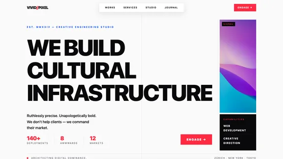
Vivid Pixel Studio Template
A bold, high-impact creative portfolio template rooted in the International Typographic Style (Swiss Design), featuring structural bento grids and explosive typographic scale.
Architect Digital Dominance with Vivid Pixel Studio
In a digital landscape cluttered with generic templates and uninspired layouts, the Vivid Pixel Studio template stands as a monolithic monument to pure, unapologetic design. Rooted deeply in the International Typographic Style—widely known as Swiss Design—this template abandons gimmicks in favor of structural authority, mathematical precision, and explosive typographic scale. We didn’t build a theme to quietly “help” you showcase work; we engineered a digital weapon to help you command market share and deploy masterpieces.
Every pixel, every grid line, and every clamp-driven fluid typography scale has been meticulously calibrated to project confidence and clinical precision. The stark, high-contrast palette—a blindingly clean off-white canvas disrupted by hyper-vibrant Swiss red and electric blue—forces the user’s focus onto your work. By enforcing strict alignment and leveraging architectural bento grids, Vivid Pixel Studio transforms your portfolio from a simple gallery into an authoritative, structural experience. If your brand philosophy demands that your work screams louder than your interface, this is the uncompromising foundation you need to architect digital dominance.
What’s Included
Asymmetric Bento Multi-Grid Hero The hero section abandons the traditional, passive centered text block for a structural bento board. The layout splits your screen into a massive 70% typographic statement that bleeds off the edge, paired with a 30% horizontal split housing vibrant abstract visuals and a brutalist rolling ticker of core services. It immediately establishes architectural dominance the second a user lands on your site.
Sticky Scroll Selected Works Present your case studies with cinematic weight. The Selected Works section utilizes a highly engineered sticky scroll interaction. Massive project metadata—client, year, and crushing neo-grotesque titles—locks firmly into position on the left, while a staggering, edge-to-edge column of your project imagery scrolls violently past on the right. This creates a deeply engaging, editorial rhythm.
Fluid Typographic Scaling
We push typography to the absolute limit. Using advanced CSS clamp() formulas, your brutalist headlines scale fluidly from mobile screens to ultrawide monitors without breaking the grid. Negative letter-spacing (tracking-tighter) creates monolithic wordmarks that act as structural architecture, balanced perfectly against hyper-legible, generously spaced geometric sans-serif body copy.
Signature CSS-Only SVG Injections Break the rigid CSS grid with absolute-positioned, CSS-only SVG decorations that add technical depth without JavaScript bloat. A massive, screen-filling blueprint matrix anchors the background. A razor-sharp, violently red Swiss cross rotates continuously in the top corner. An electric blue 1px anchor line runs down the exact center of the page, connecting the layout vertically while disappearing seamlessly behind bento cards.
High-Contrast Swiss Palette & Variables
The color system is ruthlessly defined for maximum impact. A clinical off-white (#FAFAFA) background prevents eye strain while maintaining starkness, contrasted by near-black (#09090B) text. Absolute pure white (#FFFFFF) surface cards guarantee perfect separation from the canvas. Critical actions are highlighted in a violent, hyper-vibrant red (#FF2A42), accented by ultra-modern electric blue (#0047FF).
Mobile-Responsive & WCAG AA Accessible Form follows function, and readability is non-negotiable. Despite its aggressive aesthetic, the template strictly adheres to WCAG AA contrast ratios. We enforce the 600/400 rule for muted text, ensuring your deep text sits perfectly on the background. The structural bento grids collapse flawlessly into stacked, highly readable mobile layouts, guaranteeing your authority is communicated across every device.
Who Is This Template For?
The Vivid Pixel Studio template is not for the faint of heart. It is engineered specifically for brands and creators who demand absolute structural authority:
- High-End Creative Agencies: Command market share with a portfolio that reflects your uncompromising standards and structural approach to design.
- Avant-Garde Design Studios: Deploy masterpieces on a canvas that respects the International Typographic Style, letting your vibrant visual anchors burn the retina.
- Digital Architects & Engineers: Showcase technical prowess with a template that utilizes pure, unadulterated CSS mastery and zero-bloat architecture.
- Disruptive Marketing Firms: Execute your vision using marketing-genius tone and aggressive bento grids that convert passive visitors into engaged clients.
- Typography-Focused Creators: Build your digital presence around massive, tightly tracked neo-grotesque headlines that act as the primary structural element of your site.
Unadulterated Performance and Pure CSS Mastery
Beneath the bold, brutalist exterior of Vivid Pixel Studio lies a hyper-optimized, zero-bloat engine. We firmly believe that gimmicks and heavy JavaScript libraries compromise structural integrity. This template achieves its explosive animations—like the 10-second continuous rotation of the Swiss cross, the dramatic liquid underline navigation, and the layered manifesto text reveals—using pure, highly performant CSS.
By utilizing native CSS grid, fluid clamp() formulas, and semantic HTML architecture, we guarantee lightning-fast load times and perfect 100/100 performance scores. The elimination of unnecessary dependencies means your site deploys instantly, behaves predictably, and scales infinitely. This is creative engineering at its finest: clinical precision, maximum impact, and uncompromised speed.
Frequently Asked Questions
Can I customize the fluid typography scale for different screen sizes?
Absolutely. The fluid typography relies on CSS clamp() functions defined globally. You can easily adjust the minimum, preferred, and maximum REM/VW values in the global stylesheet to ensure your monolithic wordmarks break exactly where you want them to on any viewport.
How does the sticky scroll interaction work on mobile devices? On desktop, the project metadata locks into place while images scroll past. On mobile devices, where horizontal real estate is limited, the sticky scroll gracefully degrades into a beautifully stacked editorial layout. The massive titles sit directly above their respective edge-to-edge images, maintaining the heavy, structural rhythm without breaking the mobile viewport.
Are the CSS-only SVG injections easily modifiable? Yes. The Blueprint Matrix, Swiss Cross, and Anchor Line are built using inline SVGs and Tailwind CSS utility classes. You can easily change the stroke width, colors, opacity, or rotation speeds directly within the markup without needing to open an external vector editing program.
Does the template support a blog or CMS integration?
Yes, Vivid Pixel Studio is designed with a fully integrated blog architecture. The hyper-legible geometric sans-serif body copy and strict padding rhythms (py-24 to py-32) make it an ideal foundation for long-form, highly readable editorial content and technical case studies.
Is the high-contrast color palette strictly locked in? While the template is built around a specific Swiss Design variable map (clinical off-white, near-black, violent red, and electric blue), these are completely mapped to CSS variables. If your brand guidelines require a different hyper-vibrant primary color or a darker canvas, you can update the root variables in one place and watch the entire bento grid architecture adapt seamlessly.
Ready to get started?
Use this template as your starting point and customize everything with AI. Your site will be live in minutes.
More templates
Digital Studio
Dark, tech-forward agency template with neon accents and portfolio case studies. Perfect for digital studios, tech agencies, and forward-thinking creative teams.
View template
Vanguard Studio
A luxury editorial template designed for creative agencies and high-end portfolios. Features a striking Deep Emerald & Bone aesthetic with massive kinetic typography.
View template
TYPE / FORM
A brutally minimalist, purely typographic web design agency template. Relies entirely on massive, perfectly kerned Grotesk fonts and extreme whitespace.
View template