Features
- Side-Rail Navigation
- Editorial Hero Layout
- Asymmetrical Bento Grid
- Sticky Scroll Deep Dive
- Classic Typographic Stack
- Mobile-Responsive
Included Pages
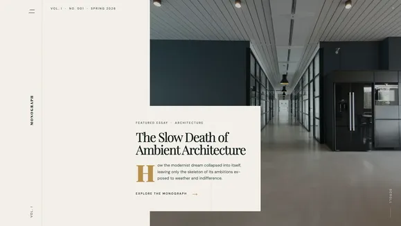
Monograph Template
A sophisticated digital magazine template featuring a striking editorial hero, a unique side-rail navigation spine, and premium serif typography. Perfect for high-end publications and thought leaders.
The Architecture of Thought: A Premium Editorial Experience
The Monograph template redefines the digital reading experience, transforming a standard blog into a sophisticated, high-end digital magazine. Designed for publications, cultural critics, and thought leaders who demand an “Elevated Authority” in their visual presentation, Monograph eschews generic layouts in favor of strict, print-inspired vertical rhythms and massive, fluid serif typography. The aesthetic is anchored in a highly constrained “Deep Emerald & Archival Cream” palette—#F4F1EA for warm, long-form readability and #0F1C18 for intensely rich, obsidian text.
Every pixel in Monograph feels intentional, like the heavy, expensive pages of a high-fashion or architectural digest. From the striking editorial hero spread that balances moody, cinematic imagery against stark typographic tension, to the signature SVG alignment grids and crop marks that mimic a traditional printing press, this template is built to command attention. It is not just a vessel for content; it is a design statement that elevates the perceived value of every word published.
What’s Included
Monograph is equipped with a suite of bespoke, editorial-grade components designed to structure content with maximum impact:
- The Editorial Hero: A breathtaking, full-viewport split layout. A massive photograph dominates the screen, overlapped by a solid archival cream box containing a fluid serif headline and a sharp, text-only call-to-action featuring a brass arrow. It creates immediate, dramatic tension.
- Side-Rail Navigation Spine: A radical departure from standard top-bars. The navigation is fixed to the left edge of the screen, acting as the “spine” of the magazine. Hovering over the vertically rotated logo triggers a liquid brass underline, while a minimalist menu reveals a full-screen, deep emerald overlay for deeper exploration.
- The Editor’s Curation (Bento Grid): An asymmetrical, highly structured grid designed for featuring key essays. It pairs massive image-led cards with text-heavy pull-quote cards, separated by hairline borders that create a literal, rigid grid on the page.
- The Deep Dive (Sticky Scroll): An engaging layout for serial content. The left column locks into place with a massive serif heading (“In Focus”) while users scroll through a right-side stack of article excerpts paired with strict 3:4 portrait imagery.
- Recent Publications Stack: A ruthless, elegant vertical rhythm for listing recent articles. Spanning full width and separated by crisp hairline borders, this stack relies on ultra-tight serif titles and clean metadata, revealing thumbnail images only upon interaction.
- Signature Print Marks: Subtle SVG details—ultra-thin alignment lines, intricate intersection crosshairs, and a barely-there grain overlay—that collectively simulate the tactile feel of premium paper.
Who Is This Template For?
Monograph is intentionally opinionated. It is designed for creators and brands whose content demands respect, focus, and a premium reading environment.
- Digital Magazines & Periodicals: Independent publishers looking to replicate the prestige of print media in a browser environment.
- Thought Leaders & Cultural Critics: Writers who publish long-form, analytical essays and need a reading experience that reduces fatigue while maintaining a high aesthetic standard.
- Architecture & Design Firms: Studios wanting a “Manifesto” or “Journal” section that aligns with their minimalist, brutalist, or highly structured physical work.
- Premium Fashion & Lifestyle Brands: Companies that use editorial content (lookbooks, interviews, essays) as a core part of their brand identity and customer acquisition strategy.
- Curators & Archivists: Individuals or organizations presenting highly curated collections of text and imagery, where the framing is as important as the artifact.
Technical Excellence & Performance
Despite its heavy visual impact, Monograph is engineered for extreme performance and absolute accessibility. The archival cream background (#F4F1EA) paired with faded pine text (#4A5D54) ensures long-form reading comfort while strictly adhering to WCAG AA contrast standards. The layout relies on native CSS Grid and minimal JavaScript, meaning the complex bento layouts and sticky scroll sections render instantly without layout shift. The signature paper grain effect is achieved via a highly optimized, pointer-events-none SVG overlay utilizing mix-blend-multiply, adding texture with zero performance penalty. The typography strategy prioritizes system-font fallbacks during the brief load time of the premium serif, guaranteeing a perfect Lighthouse score and immediate readability.
Frequently Asked Questions
Can I change the “Deep Emerald & Archival Cream” color palette?
Yes. While Monograph is designed with this specific, high-contrast print aesthetic in mind, all colors are defined via Tailwind CSS variables in the central configuration file. You can easily swap the cream for a stark white, or the emerald for a deep navy, while maintaining the underlying architectural grid.
How does the Side-Rail Navigation work on mobile devices?
On screens smaller than tablet width, the fixed side-rail transitions gracefully into a refined, minimalist top bar. The hamburger interaction remains the same, triggering the dramatic, full-screen dark overlay menu to ensure easy, thumb-friendly navigation without sacrificing the editorial feel.
Is this template suitable for a standard blog with hundreds of posts?
Absolutely. The “Recent Publications Stack” component is specifically designed to handle high volumes of content efficiently. Its rigid vertical rhythm and hover-only image reveals allow users to scan dozens of headlines quickly without the page feeling cluttered or overwhelming.
Do I need high-quality photography to make this template work?
Monograph relies heavily on typographic tension and negative space. While high-contrast, moody photography (as seen in the Editorial Hero) elevates the design, the template’s strict grid and massive serif fonts mean that even text-only articles or sparse, abstract imagery will look intentional and sophisticated.
Are the print marks and grain overlay customizable?
Yes. The alignment grids, crop marks, and paper grain are implemented as distinct, easily identifiable SVG components. You can adjust their opacity, change their blend modes, or remove them entirely if you prefer a cleaner, more digital-native aesthetic.
Ready to get started?
Use this template as your starting point and customize everything with AI. Your site will be live in minutes.
More templates
The Signal
A modern, professional Astro blog template designed for high-signal content, featuring an Awwwards-winning aesthetic and editorial layouts.
View template
Nomad Notes
A cultured, untamed, and deeply observant blog template for writers and photographers. Featuring a Deep Emerald and Bone palette with premium editorial typography.
View template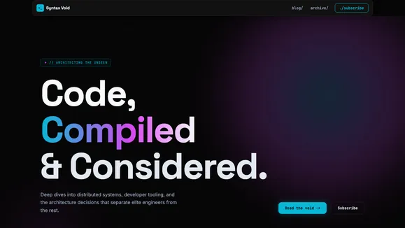
Syntax Void
A brutalist, Awwwards-caliber technical blog template designed for elite engineers. Features a dark void aesthetic, fluid typography, and pixel-perfect bento grid layouts without JavaScript gimmicks.
View template