Features
- Editorial Typography
- Magazine Spine Navigation
- Cinematic Image Gallery
- Asymmetrical Layouts
- Dark Mode Support
- Mobile-Responsive
Included Pages
Nomad Notes Template
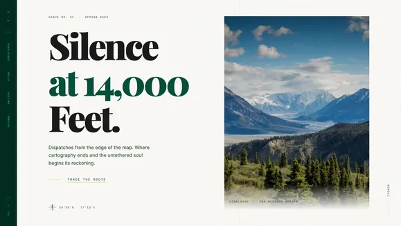
A cultured, untamed, and deeply observant blog template for writers and photographers. Featuring a Deep Emerald and Bone palette with premium editorial typography.
Dispatches From the Edge of the Map
Welcome to Terra Incognita—the foundation of the Nomad Notes template. This is not a standard blog; it is an archival journal built for the cultured, the untamed, and the deeply observant. Designed with the quiet authority of someone who has ruined a bespoke suit in a monsoon, this template pairs terse, evocative storytelling with an aesthetic that feels expensive and visceral.
The visual language is anchored in a Deep Emerald and Bone palette, offering a tactile canvas that mimics a dimly lit, leather-bound study. Massive fluid serif typography dominates the screen, acting as both content and architectural structure. Paired with high-contrast, moody photography and asymmetrical vertical stacks, the reading experience is highly editorial. Subtle topographic SVG lines and a minimalist compass rose guide the reader through your dispatches. Whether you are chronicling silence at 14,000 feet or mapping the obsidian shores of a distant coastline, Nomad Notes provides the uncompromising framing your narratives demand.
What’s Included
- Editorial Typography: Massive, tightly tracked fluid serifs scale dramatically to create architectural frames for your content, paired with highly legible body text for an uncompromising reading experience.
- Magazine Spine Navigation: A permanent, vertical side-rail navigation that acts as the spine of your journal, featuring smooth, CSS-only “ink bleed” hover effects.
- Asymmetrical Layouts: Break free from rigid grids. The article feed flows organically with alternating alignments and offset imagery, mimicking the rhythm of a high-end print magazine.
- Cinematic Image Gallery: A tight, horizontal-scroll snapshot reel built entirely with lightweight CSS snap features, perfect for showcasing macro textures and moody landscapes.
- Editorial Bento Grid: A refined approach to the bento layout, utilizing elegant borders and varying spans to highlight quotes, map coordinates, and short-form philosophy.
- Mobile-Responsive: The complex asymmetrical layouts and spine navigation seamlessly transform into intuitive, highly readable mobile experiences without losing their premium edge.
Who Is This Template For?
Nomad Notes is explicitly designed for creators who value aesthetics as much as the written word. It is perfect for:
- Travel Journalists & Essayists: Writers who need an immersive, distraction-free environment to publish long-form dispatches.
- Adventure Photographers: Visual artists seeking a moody, high-contrast gallery that treats tall vertical slices and ultra-wides with respect.
- Cultural Critics & Observers: Authors who require a sophisticated, “Vogue-meets-Hemingway” digital presence.
- Boutique Expeditions: High-end travel agencies or guides publishing exclusive content, field notes, and gear reviews.
- Lifestyle Curators: Individuals documenting a life lived off the beaten path, requiring a brand identity that feels quietly expensive and untamed.
Technical Excellence & Performance
Despite its massive typography and image-heavy asymmetrical layouts, Nomad Notes is engineered for raw speed. By leveraging lightweight CSS-only solutions for complex interactions—such as the horizontal snap galleries and the liquid underline hover states—we have eliminated unnecessary JavaScript bloat.
The template enforces strict aspect ratios (3:4, 9:16, 21:9) and optimized image loading strategies to prevent layout shifts (CLS) and ensure rapid First Contentful Paint (FCP). The fluid typography scales perfectly across viewports using native CSS clamp functions, ensuring a flawless editorial experience on any device. Built with accessibility in mind, the Deep Emerald and Bone contrast ratios comfortably pass WCAG AA standards, proving that visceral, high-end design does not require sacrificing usability or performance.
Frequently Asked Questions
Can I change the Deep Emerald and Bone color palette? Yes. While the template is designed around this specific tactile, leather-bound aesthetic, all colors are mapped to CSS variables in the global stylesheet. You can easily update the primary, background, and accent colors to fit your specific brand identity.
How does the “Magazine Spine” navigation work on mobile? The vertical side-rail navigation is a signature element on desktop. On mobile devices, where screen real estate is limited, it gracefully transforms into a fixed bottom bar or a clean, accessible hamburger menu, ensuring intuitive navigation without obstructing your content.
Is this template suited for short-form content or only long essays? Both. While the fluid typography and wide line-heights are optimized for long-form reading, the Editorial Bento Grid and Asymmetrical Vertical Stack allow you to beautifully present short quotes, coordinates, and brief dispatches.
Do I need to know how to code to update the images and text? No. Nomad Notes is designed to integrate seamlessly with modern Content Management Systems (CMS). Once connected, you can publish new dispatches, upload moody photography, and update quotes directly from your CMS dashboard without touching the underlying code.
Are the topographic lines and compass rose customizable? Yes. These subtle decorative elements are implemented as lightweight SVGs. You can easily adjust their opacity, color, or scale, or swap them out entirely for your own brand marks and geometric accents to maintain the print-magazine feel.
Ready to get started?
Use this template as your starting point and customize everything with AI. Your site will be live in minutes.
More templates
The Signal
A modern, professional Astro blog template designed for high-signal content, featuring an Awwwards-winning aesthetic and editorial layouts.
View template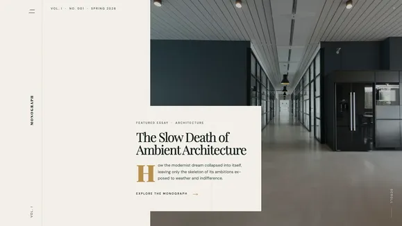
Monograph
A sophisticated digital magazine template featuring a striking editorial hero, a unique side-rail navigation spine, and premium serif typography. Perfect for high-end publications and thought leaders.
View template
Syntax Void
A brutalist, Awwwards-caliber technical blog template designed for elite engineers. Features a dark void aesthetic, fluid typography, and pixel-perfect bento grid layouts without JavaScript gimmicks.
View template