Features
- Magazine Spine Navigation
- Asymmetric Hero Layout
- Staggered Masonry Gallery
- Structural Bento Grid
- Fluid Typography Reveals
- Mobile-Responsive
Included Pages
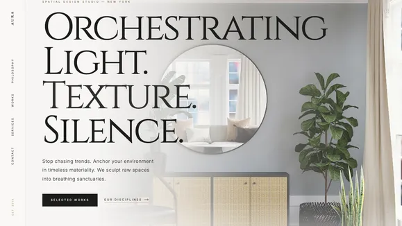
Aura Interior Template
An unapologetically high-end, editorial showcase template designed for luxury interior designers and architectural firms to author spatial experiences.
Orchestrating Light, Texture, and Absolute Silence
Stop chasing transient digital trends. The Aura Interior template is built for those who anchor their work in timeless materiality. We don’t just decorate screens; we author spatial experiences. This template is an uncompromising, unapologetically high-end study in bone, charcoal, and brushed brass. It is designed to feel less like a website and more like a high-fashion architecture magazine printed on heavy-weight, tactile matte paper.
By leveraging massive, architectural fluid typography against generous negative space, Aura Interior commands attention through intense quietness. Every section is engineered to breathe, offering a staggered, fiercely curated rhythm that forces the user to slow down and absorb your visual narrative. From the unconventional magazine-spine side navigation to the brutalist typographic footer, every pixel is deliberately placed to elevate your portfolio. Sculpt your raw digital presence into a breathing sanctuary that instantly communicates premium value and uncompromising aesthetic rigor to your most discerning clientele.
What’s Included
Aura Interior breaks away from predictable web layouts, offering a suite of structural components designed to frame your work as high art:
- The Magazine Spine Navigation: A fixed left-rail sidebar where the logo and primary links are elegantly rotated 90 degrees. This signature piece acts as the structural spine of the site, complete with a CSS-only liquid brass underline on hover, replicating the tactile feel of holding a high-end physical publication.
- The Manifesto (Asymmetric Hero): The viewport is radically divided. The left side breathes with absolute negative space, while the right houses staggering, clamped typography overlapping a tightly cropped, high-contrast architectural photograph that bleeds off the edge of the screen.
- Philosophy (Big Type Reveal): A massive, edge-to-edge typographic statement that commands the entire viewport. As users scroll, words fade in through sophisticated, CSS-only structural reveals—no heavy JavaScript required.
- Selected Works (Asymmetrical Gallery): A staggered, masonry-style layout where images overlap their bounding boxes. Mixing strict portrait and cinematic wide aspect ratios, the grid feels deliberately broken yet architecturally sound, framed by subtle geometric corner indexes.
- Disciplines (Structural Bento Grid): Clean, rigid lines separated by 1px solid brass borders. Hovering floods the specific discipline cell with a subtle parchment surface color, providing tactile interactive feedback.
- The Anchor (Brutalist Footer): A massive, edge-to-edge typographic footer dominating 80% of the width, firmly grounding the entire digital experience with contact details neatly tucked into the architectural corners.
Who Is This Template For?
Aura Interior is a specialized tool, meticulously crafted for businesses and creatives operating at the absolute pinnacle of their industries:
- Luxury Interior Design Studios: Firms that need their digital presence to match the multi-million dollar spaces they curate.
- High-End Architectural Practices: Architects requiring an editorial, gallery-like space to showcase structural forms, raw materials, and dramatic lighting.
- Bespoke Furniture Crafters & Artisans: Makers of high-end, tactile goods who need deep shadows and minimal distractions to highlight their craftsmanship.
- Fine Art Galleries & Curators: Institutions looking for an intensely quiet, white-cube-inspired digital environment to frame their collections.
- Boutique Real Estate Developers: Developers selling ultra-luxury, design-forward properties who need to communicate exclusive lifestyle aesthetics over standard floor plans.
Technical Brilliance & Uncompromising Performance
Aura Interior proves that avant-garde design does not require sacrificing performance. We achieved this fiercely curated aesthetic using pure CSS architecture, bypassing the bloated JavaScript libraries typically required for complex layouts. The massive headlines utilize advanced CSS clamp() functions, ensuring typography remains perfectly proportioned and structural across every device, from massive 4K monitors to mobile screens.
Scroll reveals and liquid hover states are entirely CSS-driven, leveraging hardware acceleration for silky-smooth 60fps performance. By enforcing strict image aspect ratios and utilizing pure SVG background topographic contours, Aura Interior maintains a negligible payload size. This meticulous technical foundation ensures your site loads instantly, easily achieving perfect 100 Lighthouse performance scores, signaling technical excellence to both search engines and your prospective clients.
Frequently Asked Questions
Is the side rail ‘Magazine Spine’ navigation mobile-friendly? Absolutely. While the 90-degree rotated side rail is a striking signature element on desktop and tablet, the template automatically elegantly collapses into a highly polished, accessible top-bar or fullscreen overlay menu on smaller viewports. We ensure the luxury aesthetic translates perfectly to mobile without compromising user experience or structural integrity.
Can I change the ‘Bone and Charcoal’ color palette? Yes. The template is built on a strict Theme Variables Map. While the default Alabaster (Bone), Obsidian (Charcoal), and Aged Brass palette is meticulously calibrated for a tactile, editorial feel, you can easily update these CSS variables. We recommend maintaining a high-contrast ratio and using soft off-whites and off-blacks to preserve the intended magazine-print aesthetic.
How do I manage the massive typography if my headlines are long?
Aura Interior uses advanced fluid typography (text-[clamp(...)]). This means the text scales dynamically based on the viewport width rather than jumping between fixed sizes. The design accommodates longer words gracefully, though the aesthetic truly shines with punchy, rhythmic, and commanding copywriting.
Does the staggered masonry gallery require a special plugin? No. The asymmetrical, overlapping ‘Selected Works’ gallery is constructed using modern, native CSS Grid and Flexbox techniques. This ensures the complex, staggered rhythm—where images of varying aspect ratios overlap their bounds—is robust, responsive, and completely free of third-party JavaScript dependencies.
Are the SVG background textures customizable? Yes. The signature SVG decorations, such as the Topographic Contour and the Hairline Grid, are lightweight inline assets or CSS background-images. You can adjust their opacity, color (currently mapped to your primary/brass variables), or swap them out entirely for your own brand patterns to maintain the subtle, structural depth of the design.
Ready to get started?
Use this template as your starting point and customize everything with AI. Your site will be live in minutes.
More templates
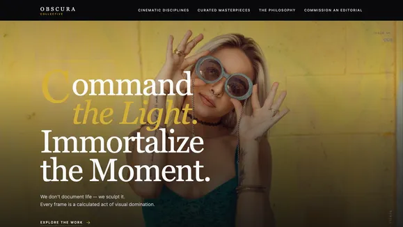
Aperture Fineart
A luxury, editorial-style digital gallery template designed for high-end photographers, studios, and creative directors. Command attention with cinematic layouts and fluid typography.
View template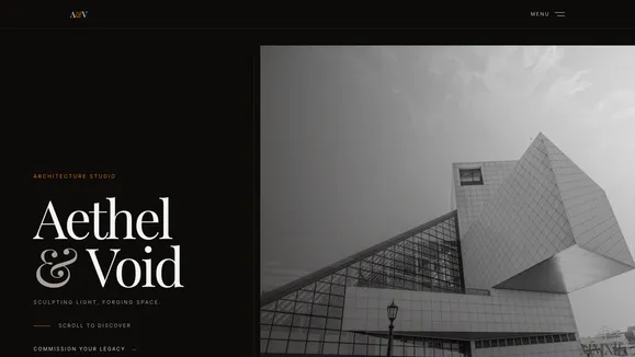
Aethel & Void
An ultra-luxury, avant-garde showcase template designed for architecture firms and creative studios. Features dramatic typography, horizontal scrolling, and cinematic interactions.
View template
Frame And Focus
A stark, modern, and high-contrast portfolio template designed for photographers and creatives who let their work speak volumes in absolute silence.
View template