Features
- Asymmetric Hero Reveal
- Cinematic Full-Screen Menu
- Horizontal Portfolio Gallery
- Sticky Scroll Storytelling
- Massive Fluid Serif Typography
- Mobile-Responsive
Included Pages
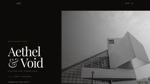
Aethel & Void Template
An ultra-luxury, avant-garde showcase template designed for architecture firms and creative studios. Features dramatic typography, horizontal scrolling, and cinematic interactions.
Engineer Spatial Masterpieces with Aethel & Void
Welcome to Aethel & Void, an ultra-luxury, avant-garde showcase template engineered specifically for vanguard architecture firms, high-end interior designers, and elite creative studios. This isn’t just a website; it is a digital monolith designed to sculpt light and forge space within the browser. Moving away from standard agency aesthetics, Aethel & Void embraces a stark, high-contrast, moody palette of obsidian, alabaster, and brushed bronze.
In the realm of high-end spatial design, your digital presence must echo the physical impact of your built environments. A standard, off-the-shelf website cannot convey the precision, the monolithic weight, or the ethereal light of your architectural projects. Aethel & Void solves this by treating the browser viewport as a canvas for structural expression. We don’t just display images; we engineer an editorial, immersive journey that commands respect and demands engagement from the very first pixel.
Every interaction is meticulously crafted to evoke the feeling of walking through a structural triumph. From the asymmetric hero reveal that utilizes negative space to create tension, to the massive fluid serif typography that bleeds off the screen, this template commands attention. It replaces the traditional portfolio with a “Vault of Structural Triumphs,” utilizing horizontal scrolling and cinematic navigation to present your work with the gravity it deserves. If your firm builds monolithic, ethereal, and unyielding spaces, Aethel & Void provides the uncompromising digital foundation to match your legacy.
What’s Included
The Asymmetric Hero Reveal A striking initial viewport experience that splits the screen unevenly. It features absolute bottom-aligned typography against a massive, offset vertical image with an aspect ratio of 3:4. As users scroll, the image and text move at different parallax speeds, creating a dynamic, high-end editorial feel immediately upon entry.
Cinematic Full-Screen Menu Navigation treated as a definitive design statement. A minimal trigger opens a full-screen, heavily backdrop-blurred overlay. The navigation links—rendered in massive fluid serifs—scale up and fade in, featuring a refined hover effect that highlights text while dimming surrounding options, ensuring every click feels deliberate, tactile, and premium.
The Horizontal Vault Gallery A completely reimagined portfolio section. Instead of standard, predictable vertical grids, users experience a side-scrolling horizontal gallery that pans through enormous, full-height architectural photographs. A solid visual anchor point—a dark monolith—grounds the section before the images begin, perfectly framing brutalist concrete structures and minimalist interiors.
Sticky Scroll Philosophy Section Tell the story of your methodology with sophisticated, deliberate pacing. The left side of the screen pins a massive heading in place, while the right side allows users to scroll through heavily padded, beautifully typeset text blocks. A delicate, asymmetrical SVG golden ratio curve breaks the rigid grid, adding an organic, unexpected touch to the structured layout.
Massive Fluid Typography & Signatures Built around a high-contrast pairing of extremely large fluid serifs for headlines and clean geometric grotesks for highly readable, structured body copy. The design is further elevated by signature SVG decorations, including a faint, absolute-positioned architect’s grid that covers the background, resembling an ethereal blueprint underlying your work.
Fully Mobile-Responsive Despite its complex asymmetric layouts, off-grid elements, and horizontal scrolling galleries, the entire template is rigorously engineered to adapt flawlessly to any device. The massive typography scales perfectly to mobile screens without breaking words, ensuring the monolithic visual impact is never compromised, regardless of viewport size.
Who Is This Template For?
Aethel & Void is meticulously designed for creators, studios, and firms who operate at the absolute highest level of their craft and require a digital presence that reflects their uncompromising standards:
- Vanguard Architecture Firms: Showcase monumental structures, brutalist concrete designs, and avant-garde glass facades with a template that matches your architectural ambition and scale.
- High-End Interior Designers: Present minimalist luxury, dramatic lighting, and bespoke spatial arrangements in a stark, high-contrast environment that elevates your portfolio imagery.
- Elite Creative Studios: Perfect for visionary design agencies that require a sophisticated, moody aesthetic that aggressively breaks away from typical tech or corporate layouts.
- Structural Engineers: Highlight engineering precision, monolithic materials, and unyielding structural triumphs with geometric, highly structured typography and rigid grid elements.
- Luxury Real Estate Developers: Sell not just properties, but highly curated spatial masterpieces, using massive editorial typography and immersive, cinematic image galleries.
Technical Superiority & Performance
Beneath its striking avant-garde exterior, Aethel & Void is engineered for uncompromising performance and technical purity. Built with modern, lightweight frameworks and utility-first CSS, the template achieves exceptional Lighthouse scores. The asymmetric layouts and cinematic animations are heavily hardware-accelerated, ensuring buttery-smooth 60fps scrolling even during complex parallax offset movements and horizontal panning sequences.
The template’s architecture relies on optimized asset delivery, meaning that the rich visual experience doesn’t come at the cost of slow page loads. The massive fluid typography is handled via modern CSS functions, reducing JavaScript overhead and ensuring instantaneous, responsive resizing across all devices. Furthermore, the signature SVG decorations—the architect’s grid, the golden ratio curve, and the monolith anchors—are inline vectors that add virtually zero weight to the page load while providing immense visual depth. Images are lazy-loaded and perfectly optimized with strict aspect ratios to prevent layout shifts. The stark color palette inherently provides exceptional contrast, guaranteeing WCAG AA accessibility compliance without sacrificing the moody, obsidian aesthetic.
Frequently Asked Questions
Can I easily change the color palette if my brand isn’t dark? While Aethel & Void is conceptually designed around a specific obsidian and brushed bronze aesthetic, the entire color system is managed through global utility classes and centralized configuration variables. You can easily swap the dark stone backgrounds or amber accents for your brand’s specific hex codes while maintaining the overall high-contrast, editorial structure of the layouts.
How does the horizontal scrolling “Vault” work on mobile touch devices? The horizontal scrolling section is built using native CSS scroll-snapping and horizontal overflow management, ensuring it feels completely natural and intuitive on touch devices. Users can swipe left and right seamlessly, and the layout gracefully adapts from full-height desktop presentation images to optimized mobile aspect ratios without relying on heavy, clunky slider plugins.
Are the fonts included, and can I easily change them? The template utilizes web-safe or highly accessible Google Fonts to achieve its massive serif and geometric grotesk pairing. These are automatically imported within the global stylesheet. You can easily replace these by updating the font imports and the corresponding font-family variables in your configuration file to match your firm’s specific typography guidelines.
Is it difficult to update the cinematic full-screen menu structure? Not at all. The cinematic overlay is built as a dedicated, well-structured component. The scale reveal and magnetic hover animations are handled via clean CSS transitions combined with minimal, highly optimized JavaScript logic. You can easily add, remove, or rename the massive fluid serif links within the component’s markup without breaking the complex animation sequences.
How do I handle SEO with such an image-heavy, visually complex site layout? The template is built with semantic HTML5 architecture and ultra-fast loading times at its core. Despite the heavy visual impact and asymmetric layouts, text remains as actual, crawlable text (not baked into images or hidden behind complex canvas elements). This ensures search engines can fully read your headlines, evaluate your sticky-scroll philosophy content, and index your site effectively. Proper alt-tags and meta-data structures are heavily prioritized out-of-the-box.
Ready to get started?
Use this template as your starting point and customize everything with AI. Your site will be live in minutes.
More templates
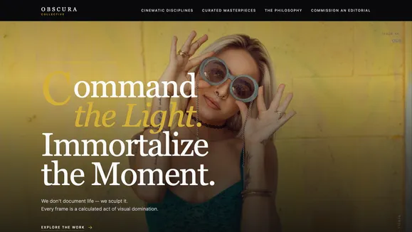
Aperture Fineart
A luxury, editorial-style digital gallery template designed for high-end photographers, studios, and creative directors. Command attention with cinematic layouts and fluid typography.
View template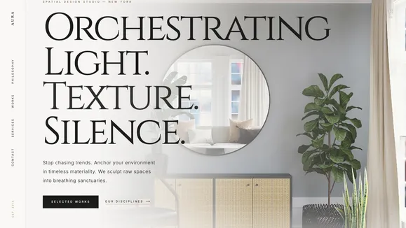
Aura Interior
An unapologetically high-end, editorial showcase template designed for luxury interior designers and architectural firms to author spatial experiences.
View template
Frame And Focus
A stark, modern, and high-contrast portfolio template designed for photographers and creatives who let their work speak volumes in absolute silence.
View template