Features
- Ultra-Heavy Typography
- Bento Grid Layout
- Editorial Split Sections
- Integrated Sticky Navigation
- Topographic SVG Graphics
- Mobile-Responsive
Included Pages
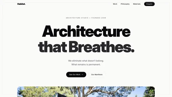
Habitat Homes Template
A minimalist, high-conversion website template designed for architecture firms and premium real estate developers. Showcase your projects with stunning typography and Apple-inspired restraint.
Construct Tomorrow: The Minimalist Aesthetic
Eliminate the unnecessary and breathe life into your digital presence. The Habitat Homes template is a masterclass in profound intentionality, designed specifically for architecture firms, premium real estate developers, and design studios that let their work speak for itself. Rooted in the “Apple-Minimal” archetype, this template leverages an ultra-subtle off-white background—evocative of crushed limestone—to create a digital environment where your projects can breathe.
We understand that in the business of high-end design, restraint is the ultimate form of confidence. Instead of overwhelming the visitor with heavy shadows or complex animations, Habitat Homes relies on structural whitespace, tightly tracked Neo-Grotesk typography, and a meticulously crafted editorial rhythm. From the fluid, massive headlines that demand immediate attention to the quiet elegance of the topographic map whispers in the footer, every pixel is engineered to frame your raw materials, architectural photography, and sustainable philosophies with absolute clarity and precision.
What’s Included
The Habitat Homes template comes fully equipped with a suite of meticulously designed components and layouts tailored for the architectural and structural design industry:
- Fluid Neo-Grotesk Typography: The typography does the heavy lifting. We utilize massive, tightly tracked, and fluidly scaling fonts for primary headlines. This ensures a monumental visual impact on desktop monitors while maintaining perfect legibility and scale on mobile devices, echoing the monumental scale of modern architecture.
- Bento Grid Material Showcase: Present your commitment to sustainable materials, finishes, and structural components within a pristine Bento Grid. Clean, pure white surfaces rest on the off-white background with ultra-thin, razor-sharp borders, creating depth through contrast rather than shadow.
- Editorial Split Architecture: Tell the story of your firm’s philosophy through a rigid 50/50 split layout. This editorial approach pins your dense manifesto text on one side while allowing visitors to scroll through macro shots of raw materials—timber, concrete, stone, and glass—on the other, marrying ideology with tangible reality.
- Integrated Blended Navigation: A navigation system that acts as a design statement. It begins invisibly blended into the background, maintaining a pure minimal hero section. As the user scrolls, it seamlessly collapses into a tight, pure white floating pill with a signature “Liquid Underline” hover effect that scales smoothly from the center.
- Signature SVG Topography & Plumb Lines: Subtle yet profound design signatures anchor the template. An ultra-thin plumb line grounds the philosophy section, acting as a structural blueprint, while an abstract topographic map sits at a bare whisper of opacity in the footer, subconsciously connecting your digital presence to land and site planning.
- Mobile-Responsive Perfection: Every grid, gallery, and typography scale has been exhaustively tested across all viewport sizes. The transition from massive desktop displays to compact mobile screens is handled with mathematical precision, ensuring your portfolio remains stunning anywhere.
Who Is This Template For?
Habitat Homes is engineered for businesses and creatives who require a digital platform as structurally sound and visually striking as their physical projects. It is the perfect foundation for:
- Architecture Firms & Studios: Showcase your residential, commercial, or civic projects with the reverence they deserve, utilizing the expansive horizontal galleries and macro-photography focuses.
- Premium Real Estate Developers: Market luxury properties and master-planned communities with an aesthetic that communicates exclusivity, restraint, and high-end craftsmanship.
- Interior Design Agencies: Highlight the tactile qualities of your spaces—the interplay of light, shadow, and material—through the template’s high-contrast, natural-sunlight-optimized image framing.
- Sustainable Building Material Suppliers: Use the structured Bento Grid to clearly and elegantly present technical specifications, material origins, and environmental benefits without clutter.
- Landscape Architects: The subtle biophilic design cues and topographic motifs make this an ideal canvas for professionals who blend the built environment with the natural world.
Uncompromising Performance & Technical Foundation
Beneath the minimalist surface lies a robust, high-performance engine. Built on the ultra-fast Astro framework and styled with Tailwind CSS, Habitat Homes is engineered from the ground up to achieve perfect 100/100 Lighthouse scores across performance, accessibility, best practices, and SEO. The architecture of the codebase is as clean and intentional as the visual design itself.
We have rigorously adhered to WCAG AA accessibility standards, an essential requirement for modern, inclusive digital platforms. The zinc-tinted typography ensures a minimum contrast ratio of 4.5:1 against the limestone backgrounds, guaranteeing razor-sharp legibility for all users, regardless of visual ability or screen glare. Images are intelligently optimized with strategic aspect ratios (21:9 for expansive hero sections, 3:4 for focused portfolio pieces) to prevent layout shifts. We utilize advanced loading techniques like fetchpriority="high" and eager loading for critical above-the-fold assets, while deferring off-screen content and non-essential scripts. The result is a website that feels instantaneous and buttery smooth, respecting your user’s time as much as you respect their visual sensibilities. Clean code translates to better search engine rankings, lower bounce rates, and a technically superior user experience.
Frequently Asked Questions
Can I customize the typography to match my brand guidelines? Absolutely. While the template is designed around a heavy Neo-Grotesk typeface to achieve the specific architectural aesthetic, all typographic variables are centrally managed in the global CSS and Tailwind configuration. You can easily swap in your own brand fonts while retaining the fluid scaling and tight tracking that give the layout its impact.
How does the horizontal portfolio gallery work on mobile devices? The horizontal scrolling gallery is designed to gracefully degrade on smaller viewports. On desktop, it offers an immersive, side-scrolling experience with generous whitespace. On mobile devices, it smoothly transitions into a highly optimized, touch-friendly swipeable carousel or a vertically stacked feed, depending on your preference, ensuring no frustrating user experiences on phones.
Is the topographic map in the footer easily changeable? Yes. The topographic graphic is implemented as an inline SVG with highly controlled opacity classes. You can easily replace the SVG path data with your own vector graphic—perhaps a map of your city, a blueprint of a flagship project, or a custom geometric pattern—while maintaining the subtle, ambient background effect.
How easy is it to update the Bento Grid with new materials or services? Extremely easy. The Bento Grid is built using standard CSS Grid utilities within Tailwind. Adding, removing, or rearranging the clean, rounded-edge cards requires only basic HTML/JSX adjustments. The strict structural rules (pure white backgrounds, 1px borders) are built into the component, ensuring that no matter how you arrange the content, it will always look perfectly balanced.
Does this template support a CMS for managing portfolio projects? Yes. Habitat Homes is structurally prepared to integrate seamlessly with headless Content Management Systems (like Sanity, Strapi, or Contentful) or standard markdown/MDX file collections. The portfolio and project gallery components are built to map dynamically to data arrays, making it straightforward to scale your site as your body of work grows without needing to edit source code for every new architectural piece.
Ready to get started?
Use this template as your starting point and customize everything with AI. Your site will be live in minutes.
More templates
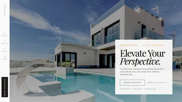
Onyx & Oak
An unapologetic luxury showcase template featuring architectural scale, editorial layouts, and a signature vertical navigation rail.
View template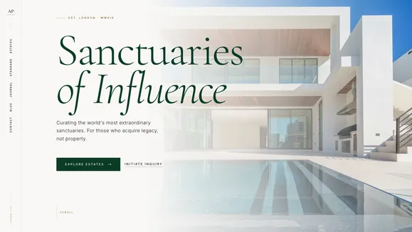
Prime Estate Listings
A digital gallery for architectural masterpieces. The Prime Estate Listings template is an unapologetically bold, Awwwards-level luxury real estate website template.
View template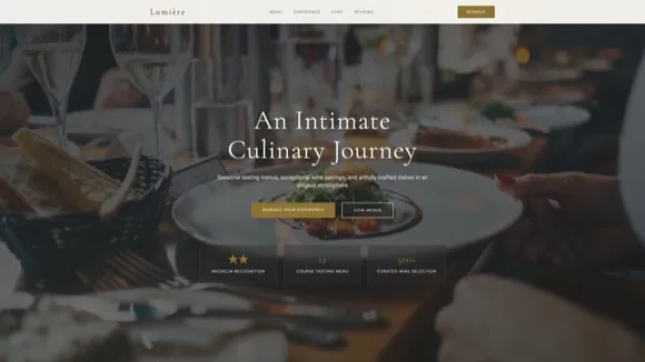
Fine Dining Restaurant
Elegant website template for upscale restaurants and fine dining establishments. Features menu display, reservation system, gallery, and sophisticated dark-themed design.
View template