Features
- Vertical Signature Navigation
- Editorial Hero Section
- Horizontal Gallery Scroll
- Asymmetrical Bento Grid
- Sticky Scroll Layout
- Massive Typography
- Mobile-Responsive
Included Pages
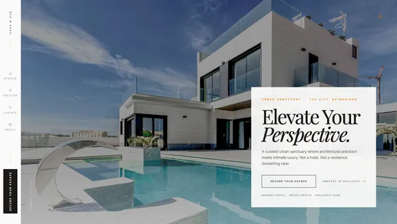
Onyx & Oak Template
An unapologetic luxury showcase template featuring architectural scale, editorial layouts, and a signature vertical navigation rail.
Unapologetic Luxury in the Heart of the City
The Onyx & Oak template is a curated urban sanctuary designed for those who demand an unapologetic standard of luxury. It abandons traditional, cluttered web layouts in favor of an architectural, editorial approach that immediately signals exclusivity and sophistication. Built with a high-contrast palette of alabaster creams, deep moody emeralds, and sophisticated muted brass accents, every element is deliberately placed to guide the eye and build desire.
The typography itself acts as structural architecture, utilizing massive, fluid serif headlines that command attention, balanced by clean, highly legible sans-serif body copy for effortless reading. This template isn’t just about presenting information; it’s about crafting an immersive experience. From the striking vertical side-rail navigation that nudges interactive elements toward the user, to the side-scrolling horizontal gallery that simulates a physical walk-through, Onyx & Oak leverages high-end design principles to elevate your brand’s digital presence to a masterpiece of modern, brutalist-luxury aesthetics.
What’s Included
- Vertical Signature Navigation: A bold, fixed side-rail navigation that replaces the standard top header. It features rotated typography and subtle opacity-to-translate hover effects, creating a distinct architectural framing for your content while maintaining intuitive usability.
- The Editorial Hero Section: A striking first impression featuring a full-bleed architectural image with a crisp, floating editorial text card. The deliberate asymmetry and vignette overlay set an immediate high-fashion, high-contrast tone.
- Horizontal Gallery Scroll: A sophisticated interaction where vertical scrolling translates into horizontal movement across massive, edge-to-edge photography, perfectly suited for showcasing expansive rooms, galleries, or architectural details.
- Asymmetrical Bento Grid (Amenities): A modern, visually engaging grid system to highlight features or amenities. Mixing portrait, landscape, and square cards breaks up monotony and allows for dynamic content pacing.
- Sticky Scroll Layout (The Neighborhood): An elegant presentation style where the section heading remains pinned to the side while rich descriptive content and imagery scroll past, ideal for storytelling or detailed locale descriptions.
- The Classic Stack Footer: A minimalist yet powerful conclusion to the page, dominated by massive, viewport-filling typography and deep emerald tones, ensuring the brand leaves a lasting impact.
- Signature SVG Decorations: Custom-designed, ultra-subtle visual anchors including the “Meridian Line” for layout alignment, a massive monogram watermark, and a delicate, pulsing compass needle overlay.
Who Is This Template For?
The Onyx & Oak template is meticulously crafted for brands and individuals who need their digital presence to reflect a high standard of luxury and architectural sophistication.
- Boutique Hotels & Urban Lofts: Perfect for showcasing exclusive, high-end accommodations where the atmosphere and design are the primary selling points.
- High-End Real Estate Developers: Ideal for marketing luxury condominiums, penthouses, or architecturally significant properties that require an editorial presentation.
- Interior Designers & Architects: A striking portfolio platform to display minimalist, brutalist, or highly textured design projects with the grandeur they deserve.
- Luxury Lifestyle Brands: Suitable for bespoke services, high-end furniture showrooms, or curated experiential brands that rely on mood, exclusivity, and visual impact.
- Exclusive Private Clubs & Venues: The perfect digital front door for venues that demand a sense of mystery, intimacy, and uncompromising standards.
Technical Excellence & Performance
Despite its visually rich, interactive nature, Onyx & Oak is built on a foundation of rigorous technical performance. The striking CSS-only animations (like the vertical navigation interactions and the horizontal gallery scroll) are highly optimized to ensure 60fps rendering without taxing the browser’s main thread. By utilizing hardware-accelerated transforms and opacity shifts rather than expensive layout recalculations, the template maintains a buttery-smooth feel even on mobile devices.
Furthermore, the design relies heavily on CSS Grid and Flexbox to manage its complex asymmetrical layouts and bento grids, resulting in exceptionally clean, semantic HTML. The high-contrast color palette isn’t just an aesthetic choice; it’s carefully calibrated to exceed WCAG AA accessibility standards, ensuring that the moody, editorial vibe doesn’t compromise legibility or usability for any visitor.
Frequently Asked Questions
How does the vertical navigation work on mobile devices? While the vertical side-rail is a signature desktop feature, we prioritize usability on smaller screens. On mobile devices, the navigation seamlessly collapses into a standard, intuitive top bar with a clean hamburger toggle, preserving screen real estate for your striking imagery.
Can I change the deep emerald and cream color palette? Yes. The template is built using a robust utility-first CSS framework (Tailwind CSS), meaning you can easily swap the primary background, text, and accent colors by updating the configuration variables, allowing you to adapt the luxurious layout to your specific brand guidelines.
Is the horizontal scrolling section difficult to manage or update? Not at all. The underlying code structure treats the horizontal gallery as a standard list of items. The complex scrolling behavior is handled entirely by optimized CSS and lightweight intersection observers, so adding or removing images is as simple as editing a standard gallery block.
What kind of photography works best with this template? Onyx & Oak thrives on high-contrast, minimalist photography with deep shadows (chiaroscuro) and warm color grading. Images that highlight textures (like concrete, velvet, or brass) and architectural details with an aspect ratio of 3:4 or 16:9 will look best within the editorial framing.
How do I edit the massive typography in the footer?
The footer typography is designed to scale fluidly based on the viewport width using specialized CSS units (vw). You can simply change the text string in the Footer component, and it will automatically expand to fill the screen edge-to-edge, maintaining the “Classic Stack” visual impact regardless of word length.
Ready to get started?
Use this template as your starting point and customize everything with AI. Your site will be live in minutes.
More templates
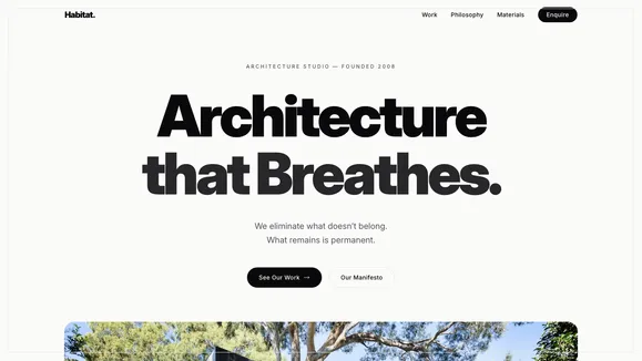
Habitat Homes
A minimalist, high-conversion website template designed for architecture firms and premium real estate developers. Showcase your projects with stunning typography and Apple-inspired restraint.
View template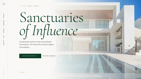
Prime Estate Listings
A digital gallery for architectural masterpieces. The Prime Estate Listings template is an unapologetically bold, Awwwards-level luxury real estate website template.
View template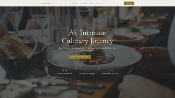
Fine Dining Restaurant
Elegant website template for upscale restaurants and fine dining establishments. Features menu display, reservation system, gallery, and sophisticated dark-themed design.
View template