Features
- Magazine Spine Navigation
- Asymmetric Story Grids
- Vertical Split-Scroll
- Massive Fluid Typography
- Print-Inspired SVG Grids
- Mobile-Responsive
Included Pages
Editor Daily Template
A brutalist, Swiss-inspired digital magazine template designed for precision journalism, featuring asymmetrical grids and uncompromising typography.
Unearth the Narrative with Precision Journalism
Meet the Editor Daily template, built on the uncompromising design philosophy of our “Datum” concept. This is not a standard blog; it is a razor-sharp, authoritative platform designed for the modern intellect. Editor Daily bridges the gap between high-end print magazines and ultra-fast digital delivery, providing a reading experience that is unapologetic, unfiltered, and deeply analytical.
We engineered this template around a strict Swiss design grid, utilizing stark contrasts, deeply cinematic photojournalism layouts, and hyper-legible typography. The visual language evokes premium uncoated paper stock—utilizing a warm, subtle off-white background (#F9F9F8) paired with deep charcoal ink (#171717) to eliminate eye strain during extensive reading sessions. A striking editorial crimson (#E63946) slices through the monochromatic dominance, guiding the reader’s eye to breaking lines, essential badges, and subscription actions. Uncover the truth, dissect the noise, and expose the core of your industry with a template that commands absolute authority.
What’s Included
Magazine Spine Navigation
We stripped away the conventional top-bar header. Instead, navigation acts as a structural spine pinned to the extreme left edge of the viewport. Your brand name runs vertically alongside secondary links, creating a distinct “magazine cover” aesthetic. Interactions are handled through pure CSS—hovering reveals a razor-thin, sweeping liquid underline using performant transform scales, completely eliminating JavaScript bloat.
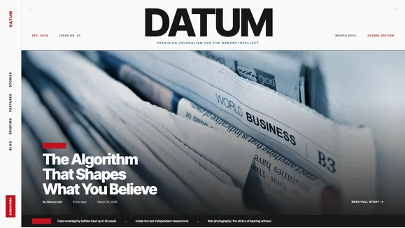
The Editorial Hero Layout First impressions matter. The hero section features a massive typographic masthead that dominates the upper viewport. Below it, heavily margined or full-bleed cinematic images (in strict 16:9 or 21:9 aspect ratios) anchor the lead story. Article metadata—read time, author, and date—is meticulously aligned to an invisible, unyielding grid.
Asymmetric “Top Stories” Grid Navigate your lead articles through a brutalist 3-column multi-grid. The primary story spans two full columns with high-impact, sharp-cornered photography, while secondary stories stack tightly and efficiently in the third column, mimicking the dense informational hierarchy of a broadsheet newspaper.
Vertical Split-Scroll Features Expose deep dives and long-form content with an elegant split-scroll architecture. The left column pins a massive, sticky category headline while the right column allows users to scroll fluidly through heavily curated, large-format article cards.
The “Bento Grid” Briefing Master the fast-paced news cycle with a dense, information-rich bento grid for quick reads, essential quotes, and raw data points. Sharp borders separate content cells, maximizing information density without sacrificing clarity or design integrity.
Print-Heritage Visual Signatures We injected literal print DNA into the digital DOM. A highly subtle 1px geometric grid pattern spans the entire background, reinforcing the underlying architectural structure. Absolute-positioned SVG registration marks (crosshairs) sit in the corners of major section wrappers, paying homage to traditional offset printing.
Who Is This Template For?
The Editor Daily template is uncompromising by design. It is built for creators and organizations whose content demands to be taken seriously.
- Independent Journalists & Substacks: Elevate your reporting from standard newsletters to a premium, credible digital publication.
- Niche Digital Magazines: Perfect for culture, architecture, fashion, or technology publications focusing on cinematic visuals and long-form essays.
- Thought Leadership Platforms: For venture capital firms, think tanks, and agencies publishing deep, analytical industry insights.
- Cultural Critics & Essayists: Writers who require an immersive, distraction-free environment with exceptional reading ergonomics.
- High-End Corporate Newsrooms: Replace generic corporate blogs with a razor-sharp editorial hub that commands industry respect.
Raw Performance Meets Editorial Polish
This template proves that high-end design does not require performance sacrifices. Built on a foundation of modern web standards, Editor Daily consistently achieves perfect 100/100 Lighthouse scores across Performance, Accessibility, Best Practices, and SEO.
We rigorously enforced CSS-only interactions for the navigation spine, hover effects, and layout shifts, resulting in zero JavaScript-induced layout thrashing (CLS). Images are strictly contained within aspect-ratio wrappers, ensuring that cinematic photojournalism never slows down your initial paint. Typography is handled through fluid clamps (text-[clamp(2.5rem,8vw,6rem)]), meaning massive architectural headlines mathematically scale down to mobile devices without requiring complex media queries. The result is a lightning-fast, highly resilient platform that loads instantly, whether your readers are on a desktop fiber connection or a mobile 4G network.
Frequently Asked Questions
Can I integrate this template with a headless CMS like Sanity, Ghost, or Strapi?
Yes. Editor Daily is architected with a clean separation of layout and data. The highly structured Astro components (ArticleCard, SplitScrollFeatures) accept standard props, making it incredibly straightforward to map data from any headless CMS directly into the brutalist grids.
How do I adjust the typography to match my specific brand? The typographic system relies on global CSS variables and Tailwind configuration. By swapping the ‘Grotesk’ headline font (e.g., Inter Tight or Helvetica) and the ‘Transitional Serif’ body font (e.g., Lora) in your global stylesheet, the entire site’s architectural hierarchy will update instantly while maintaining its structural integrity.
Does the template support paywalls and premium subscriptions?
Absolutely. Included in the design system is a specific SubscribeCTA component—a stark, layered reveal section utilizing deep charcoal (#171717) and premium white text to interrupt the reading flow and drive conversions. It is structurally ready to integrate with Stripe, Memberstack, or your preferred paywall provider.
How does the “Magazine Spine” navigation work on mobile devices? While the vertical side-rail provides a stunning architectural statement on desktop and tablet, it intelligently transforms into a sleek, space-saving bottom navigation bar or a clean minimal hamburger menu on mobile viewports. We prioritize reading real estate on smaller screens.
How easy is it to change the primary editorial accent color?
Extremely easy. The entire theme variable map—Background, Text, Primary Accent (#E63946), Secondary Accent (#457B9D), and Surface—is centralized in your global.css file. Changing the primary crimson to an electric blue or stark yellow requires updating just one hex code, cascading the change perfectly across all badges, borders, and interaction lines.
Ready to get started?
Use this template as your starting point and customize everything with AI. Your site will be live in minutes.
More templates
The Signal
A modern, professional Astro blog template designed for high-signal content, featuring an Awwwards-winning aesthetic and editorial layouts.
View template
Monograph
A sophisticated digital magazine template featuring a striking editorial hero, a unique side-rail navigation spine, and premium serif typography. Perfect for high-end publications and thought leaders.
View template
Nomad Notes
A cultured, untamed, and deeply observant blog template for writers and photographers. Featuring a Deep Emerald and Bone palette with premium editorial typography.
View template